The coolest VKontakte groups by design. New VKontakte design - horizontal group cover
Hello again. I will never get tired of saying this) In our studio, we love free communication with our users, well, that is. when you are not puzzled by the framework in which you were put in order to write the necessary article. On this site we communicate only on topics that are interesting to us and tell you about them. And so, in the previous article in the series of training materials about VKontakte, we created a VK group and talked a little about its promotion. But still, to be honest, that’s not all, the social group functionality provided to us. The network allows you to design a group or public in a very interesting and even professional way. So in this article we will tell you how to beautifully design a VK group and make a beautiful menu for it.
WIKI markup is used to create groups. In this article we will not delve too deeply into it, because... If we mix everything in one article, then we will completely confuse you, friends, but our task is different. We will tell you more about wiki markup in the next article, okay? Then let's continue.
In this article, we also can’t do without Wiki, but we use it to a minimum here, so don’t delve into it too much)). First, we need to create an interactive menu for your group; for this we need to carry out preparatory steps. First, let's change some settings in the group. We go to “Community Management”, then to “Discussions”, and here we need to connect “Materials” and make the discussions open, as shown in the picture

Ready! Next, let's start preparing the images. At this stage, it is advisable to be able to work with graphic editors, otherwise you will need to turn to freelancers, and this is a waste of your money. It’s better, of course, to learn this; it’s not difficult at all, and even more so, you’ll need it more than once. We will show you how to perform this step in Photoshop, although you can do the same in any other editor.
We make a template for the VK group as in the picture below.

The menu will be located in window A and its dimensions may differ from those shown in the image. It all depends on the size of your menu buttons. In our version, we suggested making one button per line. If you need to make 2 buttons per line, then the width of window A must be reduced to a maximum of 377px. Usually, we select the height empirically. In this option, a height of 377px is chosen when placing each element on the main page of the group in one line.

The marking stage is over, now we make a suitable image, cut our drawing into zones and write down the inscriptions we need, and do not forget that each separate zone of the picture, with the inscription that you write, will be your menu button. I don’t think it’s worth writing how to do all this, because... this will turn into a separate lesson on Photoshop, perhaps we will write about it, although I can’t promise - the site has the wrong profile. But if there are many requests, I think we’ll add an article))

When you save the project in Photoshop, removing all unnecessary elements (Photoshop cuts and saves all the pictures and white fields along with them), you need to change the name of the pictures, preferably, for convenience, numbering them in order, according to how they will be placed in the menu .

Fuuuhhhh, we're done with this stage too)) There's not much left! Next, we move on to the group itself. After we changed some settings (at the beginning of this article), we will see new tabs on the wall: “Discussions” and “Latest News”. Click on the words “New topic” in the discussions tab and create a menu page.

It must be named the same as on the graphic menu, and then fill in the description field. When you have entered all the necessary information, confidently click “Create topic”.

You will see the created message on the wall. Then, in the same way, you create the number of pages you need (depending on how many menu sections you have).

Is everything ready? if yes, then we begin to edit our menu. For this we use the “Latest News” tab. Again, feel free to click “Edit”.

Again we see the editor window, which we are no longer afraid of)), we have already met with it. Having switched to the visual editing mode (to do this, use the camera icon in the VK editor), we load all our pictures (menu fragments) in the order in which they will be found in the whole image. We change the name to something understandable to visitors. Then we switch to wiki markup mode and edit the code (we will tell you in detail about wiki markup in the next article, I’ll tell you an interesting thing.

Sample code for the proposed menu:
One point is very important here - for fragments that do not serve as a button, you need to write the “nolink” tag instead of a link to the page. Otherwise, the fragment will become clickable, and when your user clicks on it, the fragment itself will open as an independent image, but do you need that?

If something is wrong, then most likely you made an error in the code, check everything carefully, and more than once. And if you did everything correctly, then after clicking on the name of the tab of the main menu of the group, you will see a ready-made graphic menu that looks like one whole together with the VK group avatar.

If your menu at the lower level does not coincide with the avatar of the VKontakte group, then achieve alignment in the code in the lower fragment by changing the height in px. With large changes, this may affect the quality of the picture. In this case, in the original graphic editor template (in our case, Photoshop), make changes in the size of the desired fragment and, if necessary, redraw the entire layout. That's all, friends, the VK group registration is finished! You are now the owner of a professionally designed group.
In the next article from the training series about VKontakte, we told you how to make an interactive menu and design a VKontakte group professionally. In our next article, we will take a closer look at wiki markup and try to design a group by going deeper into this markup.
As always, we are very happy to receive any comments you may have, write more often, friends))
1 voteGood day, dear readers of my blog. In the previous article, we learned how to make something charming. Now let's move on to the second part. We will create a beautiful single picture for the avatar and think about an effective transition.

If this is your first time on my blog, then you don’t have to start with the first lesson. You can read this publication first and start designing, starting from this step. Now I’ll tell you how to make a beautiful VKontakte group, and you can decide later whether to use additional features.
By the end of this article, you will have an impressive and unified picture.

Method for the lazy
In order not to distract from important matters those who already know how to do everything, are in a hurry or simply don’t want to bother, I can offer a video tutorial. He will tell you how to do the same thing that I am going to talk about, only without Photoshop through the service www.vkprofi.ru .
I haven't used it and can't say whether it's paid or not. I would be grateful to those who check this information and leave a comment on this article with an answer to this burning question.
For those who want to learn
If you decide to stay and go the long way, then exciting work awaits you. It will be very useful if you are just starting your journey in online business.
You will learn many tricks, for which I will give useful recommendations for working with advertising, and you will also gain useful skills and experience.
You will need...
- Photoshop.
- Basic picture.
The photo must be large and of high quality; if you are searching in search engines, then pay attention to the desktop wallpaper. If you work for a cool community, especially related to business, then I recommend using the service http://ru.depositphotos.com . There you will find advertising images.

Choosing a picture that will promote a product is not so easy. If it is used for the business community, it must meet many requirements. Not everyone understands this. If you are promoting a hotel, inn, bar or club, it is not recommended to take photos of empty rooms.
First of all, we should not sell a place where a person can sit down, but show the emotions that he will receive from visiting the establishment. The beauty of interiors won’t surprise anyone these days. You need to create a unique atmosphere that the buyer will want to plunge into.
Nobody likes worn-out photos. If they are used all the time, then the chance of getting clients decreases. About quality, correctly set light, etc. I won't even talk. I hope you already understand this. Such options as in the photo below have not been rolling for about 5 years.

From personal experience... on one of the projects I worked with a very cool advertising manager. We took each picture apart piece by piece. The object must be at a certain distance from the center, at a specific angle, preferably in the correct optimistic range.
We had to change the color of the frame in which the painting hung in the farthest corner! At first I thought that all this was unnecessary trouble, but then they showed me the conversion after working with similar little things for comparison.
Making a template for a future beautiful group
So, when everything is ready, you need to decide on the dimensions and prepare a template for the future image. By the way, if you learn how to do this, then you can then use this technique for many other tasks and create incredible VKontakte pictures. You'll soon understand what I'm talking about.
So, let's open contact. If you look for standard VKontakte post sizes, you will see 200x500 and 700x500. However, if you use a ruler, you can make sure that the thumbnails do not correspond to these indicators. The service compresses them when loading.

Everything is the same with the picture on Ava, it really is 200x500.

With fasting everything is different.

In any case you need or download the template I prepared, or take your own screenshot. I advise you to choose the second option. Why? This way you can make templates for different tasks yourself. For example, if you have a product gallery or “Latest News” displayed on your main page.
My option is only suitable for pinned posts. The simplest and most popular design method.
Open your group or any other group where a post with a photo is pinned at the top. Like in my drawing. You can also take this photo by right-clicking on it and “Save as...”. True, I’m not sure that everything will turn out right for you in the end. Do you have time for an experiment? Share your results in the comments.

For others, the step-by-step instructions will be different. First of all, enlarge the image in the browser to 100% (press the Ctrl button and move the mouse wheel). Frankly speaking, I don’t particularly understand why this was done, but on my first attempt, precisely because of the scale, it didn’t work out.
Now press the PrtSc button. It's located in the very top row on the keyboard, after the countless "F's". After you click on it, nothing will happen. Everything is fine, you don’t need to click 100 times, open Photoshop.
Click on Ctrl+V, thereby you will paste your screen into the working field of the program. Now take the Rectangular Marquee tool and work with the left block.

Guide straight along the edge of the image. You shouldn't get the picture below. This is wrong.

Move strictly along the edge.

Grab the cursor at the upper left corner of the rectangle and move it to the lower right. In order not to fool your head with a magnifying glass, use the magnification using the Alt button and the mouse wheel.

Now press Ctrl+J. This will transfer the selected fragment to a new layer; it will appear above the background.

The same thing needs to be done with the avatar. Select and move to a new layer (Ctrl+J)

When you transfer to a new layer, the background should be active, and not the one you just created. Make sure it is highlighted.
Then you can get rid of the background. Click on the lock next to this layer, this will allow you to manipulate it.

Drag the layer to the trash can, just like a regular file from your desktop.

We're done with this. The template has been created.
Unique image for the group
I recently wrote an article about . Incorrect opening and further work with the size can significantly worsen the quality of the coolest picture, if you are interested, you can read an article about this on my blog.
Drag the photo that we will use as the main one.

It doesn't reflect correctly.

If you have the same nonsense, just make it the top one. Then, while holding down the Alt button, click on layer 1 and layer 2 so that both of them are highlighted.

They need to be combined using the right mouse button and the appropriate option. In this case, it will be more convenient for us to continue working. You won’t have to overlay and cut out the photo first for your avatar, and then for the post.

If you press Ctrl and then the thumbnail of the layer you just created. Ants run along the edges of objects from the new layer, which will tell you how to display the bottom picture. You can remove them by pressing Ctrl+D. What is now in the internal part will later be inserted into VK.

If you start moving the photo, then the running ants will “go” with it. I can advise you to set up guides. Don't know how to work with them? Watch this video here.
Once you have everything set up as it should be, you can move on to the next step. I'll show you two options to achieve the same effect. The first one is simple. On the top layer, right-click and select “Create Clipping Mask.”

But I love the second one. He's faster. Press Alt and move the cursor between the two layers, it will visually change. Then left click.

The result is this photo.

Each part can be cut out using the Frame tool and then saved as a jpeg. We add the right photo as an avatar. On the left you can simply add it as a regular post and then pin it.
It's not difficult, but if you have problems, I can recommend that you read the third publication in this series, in which I tell in detail how to make sure that when a reader clicks on your photo, he is sent to a website.

I recently became puzzled by the design of my VKontakte group. I saw a lot of beautifully designed groups and wanted to do something similar. After several hours of studying Wiki markup, I finally made a beautiful banner for myself and drop-down graphic menu, leading directly to the pages of my site. In a nutshell, how it's done. First, two pictures are created simultaneously in Photoshop, then one of them is cut into several parts. Next, on the editing pages of VKontakte, a special code with external links is inserted. Well, now let's talk about everything in order.
I create VKontakte groups
High-quality design of VK groups and public pages, pinned menu, drop-down menu, internal graphic menu, catalogs, internal navigation - prices And portfolio.
Attention!
Due to the next VKontakte update dated October 31, 2016, this option for group design has become irrelevant. A somewhat similar menu can be implemented on the Latest News tab in the block under the status line. But this will be a separate menu, and not a single composition with an avatar.
Step 1.
Create a new document in Photoshop about 850x700 pixels in size and fill it with white. In this example, I immediately superimposed the VKontakte interface on top for clarity. Now we need to cut out two windows in the layer, through which the actual graphic design itself will be visible. First, select a rectangle measuring 200x500 pixels and press Del. Then select a rectangle of size 510x309 and also press Del. 
Align the rectangles to the bottom edge, the distance between the shapes is 50 pixels. This design is designed for one line of group name, one line of status and three lines of description and technical information. If you have a different number of lines, then adjust the height of the left image according to the location.
Step 2.
Now under this layer we place all our graphic design. In this case, I put a picture with the main background, then wrote text, and then in the left rectangle. 
Step 3.
Now we immediately save the right rectangle (avatar) as a separate picture measuring 200x500 pixels. This is a ready-made picture for group design. It is loaded into the block in the upper right corner of the group where it says “Update Photo”. And the left picture needs to be cut into several pictures according to the number of menu items. In this case, these are 5 images with a width of 510 pixels. 
Step 4.
At this step we need to upload our cut VKontakte pictures. To do this, immediately below the group description, select the “Latest News” block, I think that’s what it’s called in the original. I renamed it “Menu”. Click “Edit”. Important! Firstly, you must have an Open Group, not a Page. Because there is simply no such item on the Page. And second, in the Community Management > Information > Materials menu, the “Open” item should be selected. 
Step 5.
So, in the “Editing” tab we click on the camera icon and load our five cut menu pictures. VKontakte will upload them in its own way, reducing the size to 400 pixels in width and assigning the noborder tag to the image. In the next step we have to slightly correct the code. 
Step 6.
Namely, we set the original image sizes and change the noborder tag to the nopadding tag. We also need to put down the URL of the links from each menu item. In this case, the first link leads to the internal VKontakte page, and the remaining four links lead directly to the pages of my website. 
Below is the original working code for my menu. You can use it as a base. In it you can change the pictures to your own, substitute your sizes and add your links. And make sure that there are no spaces between the square brackets in the code, and also no line breaks, otherwise the graphic image will have spaces between the images.
[][][]
Step 7
I repeat once again, to open this menu you need to click on the “Menu” inscription. And so it is always folded. Read the comments to the post, there are many questions addressed there. Well, join my VKontakte group.
Some tips on how to make VKontakte group design effective. Learn the principles of properly designing the elements of a commercial community so that it becomes a stable source of profit for your business.
You will learn how to correctly set tasks for developing the design of a VKontakte group for your employees or freelancers. You will be able to control the work process and evaluate the final result not only from an aesthetic point of view, but also taking into account the ability of the created design to convert visitors into clients.
Where to start working on design?
Start developing a VKontakte group design from defining the target audience, identifying their wants and needs. You must have clear ideas about who and how you will sell a certain product or service.
Study your competitors. It is logical that competitors have already passed the stage of searching for the target audience. You need to analyze their websites and social media groups. This will help determine the audience that the texts on your competitors' websites are aimed at.
Identify the strengths and weaknesses of your proposal compared to those on the market. Write down 3-5 advantages that your business has. These could be: free shipping, 5-year warranty, experienced specialists, wide range, etc.
Make your trade proposal, based on research of the target audience and competitors’ sites. This is the title of the avatar or cover of the VKontakte group. It plays a huge role in deciding whether to further explore community content. Your proposal should clearly define the topic, be simple and understandable to any visitor. When drafting it, think about the customer's benefit, not the product.
People don't want to buy a product/service - they want a solution to their problems.
All these are preparatory stages that must be completed before starting work on the design of the VKontakte group. They are the ones who determine the content that needs to be placed on the design layout.
Important elements in the design of VKontakte groups
We’ve decided on the content, now it’s time to find out recommendations for designing group elements. We will analyze only the most necessary: an avatar and a thumbnail, a cover, a banner for a pinned post and a menu.
Avatar
Place your sales offer on it to provoke visitors to take a targeted action. In addition, the avatar should contain contact information where you can be contacted, an image of a product or a thematic illustration for services.
Use only high-quality images and forget about clipart from free stock photos. The search for images for effective VKontakte group design should be done on the sites pinterest.com, freepik.com, flaticon.com, or, as a last resort, google.ru. But it’s better to select images from paid photo stocks. Enter search queries only in English. If you have difficulties with English, then feel free to use Google translator.
To make it easier for you to make the right decision, we We’re giving away 500 rudds for menu design to everyone who follows the specified link. To receive a discount, simply enter the code HWC1817-500-menu when submitting an application.
In this article, I would like to systematize all my knowledge on designing VKontakte groups based on my experience of interacting with clients and their preferences. Moreover, over the past six months, VKontakte has made many changes that many are not even aware of. I wanted to dwell on some of the innovations in more detail, because among them there are really worthwhile and useful things. We all seem to have recovered from some shock after the redesign of VKontakte, and behind the visible changes we discovered the multivariate functioning and content of the group. So now the design of groups involves a complex procedure that is not limited solely to the graphic component in the form of beautiful pictures. Now owners need to take into account many nuances of building a group structure, depending on the topic of the business and the convenience of users.
This mainly concerns choosing a graphic design from two mutually exclusive options, developing an internal menu, choosing an entry point to the internal menu, understanding the difference between a catalog and a product display, preparing promotional materials to promote the group, and using useful applications. But, first things first. First, we will look at the basic design elements of the group, then we will move on to their interaction in the form of various combinations and then we will talk about some useful features and subtleties.
1. Horizontal cover (header)
Let's start with a horizontal cover or header. VKontakte developers assure us that the cover, due to its size, provides greater maneuverability in providing and visualizing information. Usually, in addition to a beautiful picture, the header contains a logo, accompanying information, contacts, a call to join the group, and a website address. I have a suspicion that someday covers will become the only possible design option for the group, so I would recommend switching to them immediately in order to avoid force majeure redesigns later.


How to upload a cover
To download the cover, you need to go to Community Management >> Basic Information block >> Community Cover >> Upload. Recommended cover size is 1590x400 pixels. There cannot be any working buttons in the header that can be clicked - essentially it’s a picture and that’s it. Today, the cover is visible on mobile devices, and seems to be already visible in applications and clients.

Wiki tab Latest news
The top block under the header can now contain three tabs: pinned post, information about the community and wiki menu (only in groups; there is no such tab on public pages). The emphasis is still on the pinned post, but even with its presence, the user will now always have access to information about the community by switching between tabs. For the wiki menu tab to appear (it is initially called Latest News), you need to go to Community Management » Sections » Materials » Restricted (or Open) » Save.

2. Vertical avatar
Now let's turn our attention to the good old avatar for a group measuring 200x500 pixels. For now, it is also a way to design a group. Typically, the avatar contains the following information: logo, accompanying text or slogan, contacts, call to join the group. On mobile devices, the entire avatar is not visible, only part of it is visible - the thumbnail. To design a group, you can use either a horizontal header (cover) or a vertical banner. If there is a header, the vertical avatar is not visible. There cannot be any working buttons on the avatar that can be pressed - essentially it’s a picture and that’s it.


3. Miniature
Currently, a vertical avatar is used to create a thumbnail, the minimum size of which is 200x200 pixels. The thumbnail is used in posts and entries in the form of a small circle near the title and in the form of a larger circle in some selections and community mentions. In connection with the transition to a round shape, the requirements for miniatures have become more stringent. In order for the text on the miniature to be fully readable, it must visually not extend beyond the boundaries of the circle.

How to upload a thumbnail
The miniature has become a completely independent element, and when using the cover (header) in the design of the group, you now have to make a separate miniature, keep in mind. If the group does not have a header (cover), then to upload a thumbnail you need to click “Upload photo” in the avatar block (top right). If the design contains a header (cover), then to upload the thumbnail you need to click on the circle immediately under the header and select “Upload photo” there.

4. Banner
Banner (English banner - flag, banner) is a graphic image of an informational, advertising or incentive nature. The banner is attached as a picture to the post and can only have one internal link. Many are still convinced that several links can be made from a banner on the main page. This is not true, just one link and that's it. I would highlight the following types of banners.
4.1 Information banner
A common type of banner containing general information about a company, group, service or event with a detailed list of benefits and other accompanying materials. Often used as a pinned post in a group. The size of this banner is 510x307 pixels. At this size, the bottom of the banner coincides with the avatar. If there is no connection with the avatar, then you can use any size. For example, I use the size 600x350 pixels. The square format of 510x510 pixels is also convenient and gaining popularity now - with this size, the banner occupies the largest possible area in the news feed.

4.2 Banner to enter the internal menu
If we add the catchy inscription “Open menu” to the banner from the previous paragraph, then we will get a banner whose main task is to serve as an entry point to the internal menu. Sometimes they create a decoy in the form of several buttons on a banner, but this is an illusion; when clicked, the user still gets to the internal page, and there each button has its own link. The size of this banner is 510x307 pixels. With this size, the bottom of the banner coincides with the avatar. If the entrance to the menu is not tied to the avatar, then you can make the banner any size, even a narrow button with the inscription “Open menu”. The main thing is that the banner width is at least 510 pixels.

4.3 Card for repost, promotions
Recently, cards for reposts or promotions have become especially relevant. Its task is a call to specific action. Basically it’s “Join the group, repost or like and win a prize.” Such banners are used as part of advertising campaigns or promotions both in their own groups and for promotion in other groups. I usually use 600x350 pixels.

4.4 Banner with gif animation
After VK developers made larger sizes for gif images at the beginning of the year, gifs immediately stood on par with information banners. For example, on a GIF banner you can show images of several changing products or texts - movement immediately attracts attention. And when the function was added in June autorun gif animations in the news feed, GIFs have become the object of close attention of advertisers and marketers.

5. Avatar+fixed banner design
Until recently, this modular design, consisting of an avatar and a pinned banner, was the most popular way to design groups. More details on how to do this design are described in the lesson. With the advent of the header (cover), the popularity of this design may decrease slightly.
Plus, there is a possibility that VKontakte will again change some parameters of the blocks and then the entire design will fall off, as has happened twice in the last six months. So, dear group owners, when choosing a design for your group, take this fact into account. Yes, and one more thing, in mobile devices all the beauty of a single picture is not visible, since the avatar is not displayed, but only a thumbnail, and the pinned post is located just below.


6. Internal navigation menu
The menu in the form of active links is located on the internal VKontakte page and is written using wiki markup commands. How to create the inner page itself is described in the lesson. Using the menu, the user navigates through the group. Below you will look at the types of internal menu, but for now we will focus on several important points.
Entry points to the internal menu
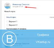
I would like to point out one subtle point that is often not given importance. Sometimes clients order an internal menu from me, but have absolutely no idea how the user will get to this very internal menu. And you can get to it in two ways: either through a pinned banner (see paragraph 4.2), or through a text link in the top tab under the status line (see figure below). Sometimes a text link is also placed in the “Links” block in the right column of the interface.

Internal menu links
Typically, when ordering, customers indicate the following menu items: About us, Our products (catalog), Delivery methods, Payment, Guarantees, Reviews, Contacts, Promotions, Discounts, Schedule, How to order, Portfolio, Questions and answers, Info, Place an order. Links from menu items can go to the corresponding sections of the external site. Then the link automatically opens in a new window. Most of the points lead to internal VKontakte pages. In this case, the page opens in the same window and you have to make a link or a “Return to main menu” button.
Links to albums with photos and videos open in a new window. Links to topics with discussions (for example Reviews), to a dialog box for writing messages, to applications (see point 10), to selection by hashtags (see point 12) open in the same window and in this case you can get back to the menu only through the main page of the site, or through the “Back” button in the browser. This is perhaps the most inconvenient moment with such links.
Editing the menu
Clients often ask me if it is possible to edit the internal menu. My answer is, if you are a confident user and are familiar with wiki markup and editing modes, then you can edit. But if you are not familiar with all this, then absolutely not. In this case, you will simply ruin all the settings.
I will quote the words of the VKontakte developers themselves. “One simple piece of advice will save you a lot of effort and nerves: work in only one mode. Either it is visual mode or wiki markup mode. It is switching between these two modes while working on the markup that brings most of the problems: pictures may become smaller, various parameters may disappear. This is one of those things that will definitely be corrected in the future, but for now we need to keep this fact in mind.”
Mobile responsiveness
And one more point about adaptability. To make the internal menu look the same on mobile devices, you need to layout it on tables. Then the image will be rigidly fixed. Otherwise, when the screen size is reduced, the pictures tend to move one under the other, violating the originally intended order.
Here, again, are the developers’ words about adaptability. “The wiki menu is displayed in mobile browsers, but does not adapt to screen size, which is why images may not look the same as on a computer. You can find guides online on how to adapt wiki markup for mobile devices, but even they do not guarantee 100% performance on all devices.”
7. Types of internal navigation menu
Below are the most common types of internal menus. There are simpler and cheaper solutions that have a high degree of reliability. And there are more complex and labor-intensive designs in terms of graphics and layout. But they look more impressive.

7.2 Large graphical menu
In this case, a vertical row of links is located on a large background image and has a rigidly fixed structure. Here's the lesson.

7.3 Menu in the form of icons, tiles
This design involves several rows and columns in the form of graphic icons and inscriptions for them, or graphic multi-colored or monochrome tiles.

7.4 Dynamic menu with navigation effect
A very impressive design that simulates site navigation with the effect of button clicks or other markings of visited links. Such a menu is quite difficult to manage and requires skills in communicating with wiki markup, since you will also have to edit information on pages in wiki markup. Here is a lesson on this topic.