VKontakte graphic menu. How to make a beautiful menu for a VKontakte group
Today I will continue my “Immersion in VK groups”. In the third part of the “series”, I told and showed. Today, let's talk about designing the VKontakte group menu!
In the first article about creating a menu, there were a lot of questions in the comments, so before starting a new topic, I will answer frequently asked questions.
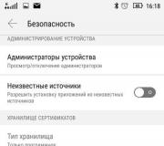
Question 1: The first and most common: “Where is the code in the menu?” or “if there is no bookmark when editing “Source Code”, how to add an internal page?” or “I still don’t understand what to do if the code doesn’t appear!”
Answer 1: VK has changed the editor, now you can switch between the visual editor and the code with just one click (upper right corner of the editor):

To check which editor you are in: move your mouse over this button, write some text and highlight it in bold - if unusual characters appear, then this is code
Question 2: The second, really problematic: “ how to remove spaces between pictures?»
Answer 2: I admit, I was scared myself when the client’s menu started working for the first time. Now I quickly edit it, but then it was not fun. See:

Add the nopadding tag; and everything will fall into place!
Space creeps in between the pictures and the menu looks broken. For the ignorant, this may not be normal, but for the ignorant, this is at least unprofessional. So what's the big deal? Ah, it's very simple! In VK, some updates are constantly happening, new algorithms are being introduced... and even the editor is crooked... sometimes, for no apparent reason, important tags drop out of the code and then we see this picture. To fix this, you need to look into the code and make the necessary adjustments. The code format should be like this:
Template: [] Example: []
Usually menu pictures are expanded because the code leaves out nopadding; — we put it in place and everything is aligned. Before saving the result, click on the “Preview” button to make sure that everything is smooth.
Question 3: News. In October 2012, VKontakte forcibly cut off the avatars of groups and public pages. Now their size has a common standard of 200x500 pixels. So, if you had a larger avatar in your group, then make an update (update the avatar).
By the way, along with cropping, VK introduced another innovation regarding group photos: now by clicking on the avatar, we, just like in the account, will be able to see all the albums of the community. It's convenient! And from this, new functionality is drawn in the group’s communications.
Soooo, we're done with the questions... now let's move on to creating the menu itself!
Step 1. How to create a menu in contact and make nested pages:
First of all, let’s make sure that you know how to create a group menu in contact and go through a few instructions:

What do you think of my cheat sheet?
This is the cheat sheet I came up with! For greater clarity, I will describe each number:
Do this operation with all subpages and your menu will be ready.
Eat! We created the menu, created the internal pages, filled them in, now let's move on to creating a beautiful graphic menu.
Step 2. How to create a beautiful graphic menu in Contact and install it:
I won’t give you the whole theory of how wiki markup works in contact, we have other goals now. To create a visual menu in a VK group, you don’t need to know all the wiki markup. Let's move on to creating a visual menu!
First, I’ll show you the code and result of my menu:

I admit, I made it specifically to write this article. Everyone “didn’t get around to it,” you know, like “a shoemaker without boots.” But now I have a visual menu in the VK group!
I won’t tell you how to draw a picture for the menu, that’s up to the designers, I draw it myself, but not so professionally. , at the end of the article, I gave a video on how to draw a simple menu in Photoshop, check it out, maybe you can do it on your own. If not, order the menu picture from .
I'll show you a moderately complex menu installation option. The difference is in the number of elements. A menu that is simply cut into strips is the simplest implementation. The more clickable buttons in a line, the more complex its execution. Although, knowing the peculiarity, everything is simple! It's just a matter of time. So, the width of the image should be:
370 px – if you have two or more objects in a line, like I have social media buttons
And max 388 px – if we cut the picture in a simple way, only into lines, without dividing it into small objects. This is the feature you need to know when cutting a menu into buttons. My image size for the entire menu turned out to be 370x456 px.
After the picture is cut into the required number of objects and saved in a separate album, we upload this album to VK. We upload to the account profile, not to the group! Since in group albums there is no longer an option to hide albums. A technical album in a corporate (for example) group is not needed at all, so we hide the menu items in the account album:

Technical album VK
Once you have set up the "Only Me" privacy. Let's move on to installing the menu itself. I’ll give you a code example that would be a template for you and let’s look at what it consists of:
[]
Where, photo7632142_296911699– this is the address of the picture! We look at it in the address bar of the picture:

From the first picture, let's start inserting a menu into the VKontakte group
You need a short address of the image, to do this go to the album itself:

Go to the album itself to get the desired image address!
...and starting from the first picture, move them to the group menu.

Adding image size to the menu code!
So, the address of the image has been added, the size has been indicated, now we put the tag nopadding;- it is needed so that our pictures fit tightly to each other. And the last step is to put a link to the page where the visitor will go after clicking on the picture.
A little clarification here! We write external links, links to VK albums and discussions in full, and links to internal pages in the format page-32734125_44298120. At the beginning and end of the line, do not forget to put two square quotes and no spaces.
Clarification 2: when we link to internal pages without pictures, we use single square quotes for discussions, albums and external links.
Lines in which you have two or more elements are inserted into the code without spaces. Insert each line of the picture one after the other. Because if you press Enter after the line with the picture, the picture will jump to a new line and the menu will move. We need the menu to be displayed as a whole, so we don’t need any extra spaces or “interters”!
After you have transferred all the pictures to the menu and designed them (size, link), save the result and admire your work! All! Ready!
If so, then you have come to the right article. Here we will discuss how to create a group [um, I’ll correct you, community] on the VK social network and users will have a good impression of you. Times change, and people become smarter and can immediately solve
As you probably already know, VK provides 3 options for creating groups [communities]:
- Group
- Public page
- Event
Based on your goals and objectives, determine for yourself which option suits you best. Naturally, events are created for certain events. Let's figure it out - what to choose - a group or a public?
In fact, the capabilities of a VKontakte group and public are not too different.
Create a public page, not a group.
There are a number of advantages to a public instead of a group. The public is easier to design and use, and it is also included in the block of interesting user pages. Based on this, you can find out the user's interests. In this case, it is photography and everything connected with it.

As for the group, potential clients can ask questions on its wall. At first, this looks like an advantage, but only if you don’t have a content plan and your goal is only that people will start asking. But in such groups, engagement is very weak.

Also in groups there is an opportunity to invite friends. In the public this function has been reduced. But it’s unlikely that your friends are your target audience to whom you are going to sell services or goods. Therefore, focusing on inviting doesn’t make much sense either.
Another advantage of the group is the ability to add an online store application using the secure https protocol via an iframe application, which will allow the user to place an order without leaving the social network.

Community Header
Now let's touch on the topic of the title of our community. How to make a headline correctly so that it works for our business and starts generating traffic. For example, your type of activity is selling women's clothing in Nizhny Novgorod.
By logging into Yandex you can see that...

The group got to the top of the search results for this request and is somehow ranked for this request. Accordingly, it would be reasonable to name your group this way in order to get into the search results of both Yandex and VKontakte search.
Occupation - a keyword by which users can potentially search for you - if your occupation is tied to a city, then in the group itself you can also indicate the city where you are located; search engines will identify your group by geolocation.
Ideally, the title format looks like this:
Online women's clothing store | Lovandzzoo
where, “Online women’s clothing store” is the key query
Lovandzzoo is the name of your brand
Avatar and cover
Design is not an important cog in the mechanism of an online business, but a nicely designed group without suspicious or cheap design inspires more trust. And the design of the community begins with a well-designed avatar and community cover.
A community avatar is the face of your company and it should reflect both the company’s positioning and contact information. You must indicate:
- type of activity
- logo and brand name
- telephone
- call to action - for example, “Subscribe to take care of your health and appearance.”
- arrow indicating subscribe.
- also indicate the address and external resource - website.
An example of a good ava:
![]()
Now let's talk about the cover design, which has now gained popularity after the innovations on VKontakte. In principle, the approach is the same as for designing an avatar, only now we transfer everything to a horizontal position. Here are some examples of good covers with different design styles. One thing they have in common is that it is clear where a person has ended up and what he sees. The cover should answer questions "What is this?".


Please note the back cover and the arrows pointing to:
- logo
- brand
- what is the public about
- how content is useful for subscribers
- and what the user will receive if he subscribes
You can do the same - this is a standard working structure for competently designing the cover of communities.
Wiki menu
You can implement popular wiki menus into your community design. The main thing is to think about the menu structure, because in a sense, by creating a menu using wiki markup, you are creating a mini-site on a social network and the user should not get lost in it. Look at this wiki menu and understand what a competent wiki menu structure means.
An example of a good and attractive menu.

Depending on the niche, the wiki menu may contain the following sections
- if this is a sale of individuals. goods and services - delivery conditions, product categories, price lists, how to order, description, etc.
- if the sale of information products
is a structured content base, such as
Another example of a good menu:

Links
In the links, indicate all your external resources - lead magnets, main sites, channels on other social networks where the audience will go. This will help increase traffic to your resource from social networks.

Read also>>>>
Content is King
Content is King
Bill Gates once said and he was right. Social networks exist and are popularized due to the presence of constantly generated content on them. Without him, the group is burned out and forgotten about. Therefore, you need to post regularly to remind yourself.
But how to properly format posts so that they are liked and shared?
Everything is very simple here - you don’t need to use pictures with cheap design and dull copywriting in posts - not only do users not like them, the social network itself ignores this content format. This is roughly what the picture should look like.

Nobody demands design work from you, but only a design that is pleasant and not irritating to the eye. If the content is visually perceived well, then the likelihood of it being shared is high.
CHPS (Humanly Understandable Links) in posts
Try not to indicate original links or links with UTM tags, but shorten them using the service vk.com/cc in the header, under the post title. VK users ignore posts with long links (especially at the beginning). They are interested in content. Compress links in posts using vk. com/ cc
Here, in a specific example, you can see how such a link looks in a post:

Also try not to use obvious and trivial headings. The purpose of headlines is to attract the attention of community subscribers in the news feed. For example, title “16+1 Effective and Healing Properties of Pumpkin Seed Oil That 95% of People on the Planet Don’t Know About” will work better to attract the attention of the audience than the nondescript “Properties of Pumpkin Seed Oil.” Try to add numbers and specifics to the title. Then the post will attract attention.
Are you ready to challenge your dream and realize your ideas and ideas on the Internet, and start making serious money online?
Diversify your content
Identify at least 30 topics (needs) that may be closely related to your direction and use a timer to start posting.

Create interesting content about your niche. For example, in the topic of sports, you can write motivational content, educational and expert content. The list of needs can be made endless and the problem is choosing a format, so that posting by itself will disappear. In each post, use different calls to action with justification for the reason - “Like it if it was useful”, “Repost if you think all your friends should know about it.”
Add emoji to your posts to make them more colorful and attractive. But don't overspam.

Find out
Video
In all videos uploaded to YouTube, insert a cover so that there is packaging and wrapping that will catch the user’s attention. Videos without a wrapper look very crude, in which it is already clear that there will be no interest in downloading them.
Here's an example of what a video cover should look like:

The click-through rate of a video with a cover is many times higher, because there is packaging - a wrapper that attracts the audience. The picture should play its role – arousing interest in what’s inside.
Implement!
Goods
Products section - prices are indicated in ascending order - the lowest prices should be on the display.

Detailed description in the product card itself. And if there is a website, add a link to the product card. The “Write to the seller” button is linked to personal messages from the person who leads the group, or the manager who monitors the group

We're reaching out to the community
We fill out the discussion section and create subsections in it - “Your questions”, “How to order”, “Vacancies”. You can also create a questionnaire for variety.

Don’t forget to fill out your contact details too. So that a person understands who to contact - regarding ordering goods, advertising or your services.
To understand who to ask a question, write down the position - manager and the person’s responsibilities. This way you will quickly let the user know who he should contact with his question.

The most important thing, I almost forgot :) - we fill the group description with the necessary information with all outgoing links. Be sure to separate the description into blocks of text of 3-4 lines so that the text is readable - no one has yet canceled the copywriting rules for text readability.
Here is an example of how well a description in a community should be:

P.S.
Well, what do you say? Was the content helpful?
Do you understand how to create a group on VKontakte?
If yes, then I’m waiting for feedback in the comments - I answer instantly. You won't have time to blink. I like to discuss the topic of promotion on social networks. If I don’t have time, then write
First of all, you need to decorate it beautifully. After all, as you know, we judge everything “by our clothes.” This article will help you beautifully design a VKontakte group on one's own.
How to formalize the name of a VKontakte group?
The first thing you need to pay attention to when creating a VKontakte group is Name. There are three main parameters to consider when choosing a name:
The search for the VKontakte social network works in the following way: there are two groups with the names “Work on the Internet” and “Work on the Internet without investments.” When a VKontakte user enters the query “work on the Internet”, the group with the corresponding name will be higher, even if the number of subscribers is equal or the second group has a slight advantage.
Let's conclude: the owners of the famous online store Ali Express, when creating a group for it, do not have to indicate its topic in the name; most already know it. For a less popular site, online store, forum, when creating a group, it is better to indicate the topic in the name, as we did above..
How to register a status for a VKontakte group?
The status of a VKontakte group is less important than its name, but it is worth paying attention to. Let's figure out how to do it right create a status for a VKontakte group? The main thing is not to overload it too much; it should contain only the most important information:

If at the moment you do not know how to register the status of a VKontakte group, then it is better to postpone it. You shouldn't put just anything in it. The absence of a status will not harm the design of your group, but meaningless information in it may confuse visitors. By the way, For public pages, status is more important, because it appears in the "Pages of Interest" menu as a description.

How to write a description of a VKontakte group?
Now we'll figure it out how to write a description of a VKontakte group, or rather the text that can be entered in the community settings. There are several solutions for this:
In addition, VKontakte has a limit on the size of text in the group description that will be displayed without collapsing - 600 characters with spaces. After exceeding this limit, the description will be minimized, which will make it look unsightly. You can see this situation in the picture below.

In this regard, I recommend using pinned messages in the header when creating a description of a VKontakte group, creating a picture for them with a description, emoticons, text and even a menu. This will all add color to your community.
How to make an avatar for a VKontakte group?
Now we will try to figure out one of the most important aspects of designing a VKontakte group - how to make an avatar? For those who have their own money, you can register on a freelance exchange and order an avatar and other elements for the group (banner, menu, etc.) from an experienced web designer. But you can go another way, make an avatar for the VKontakte group yourself.
First of all, you need to decide what size you will need to create an avatar for the VKontakte group. The maximum width of a group avatar is 200 pixels (hereinafter simply px), and the maximum height is 500 px. Larger avatars will be scaled down according to the specified proportions. Avatars that are smaller than the specified sizes will, on the contrary, be enlarged and distorted in the display. Therefore, create an avatar for the VKontakte group with a width of 200 px and a height of 200 to 500 px.
When creating an avatar for a VKontakte group, you should remember its miniature, which is 200 px in width and height. So the main information load of the avatar (name or description of the group, motto, call to action, etc.) needs to be placed in one area that will correspond to the given dimensions.
The easiest way make an avatar for a VKontakte group in Photoshop. Moreover, it is not necessary to know it and be able to use all the functions. It is enough to learn how to use basic tools (selecting elements, working with layers, etc.). Below you can see an example of an avatar I made for a VKontakte group.
This avatar consists of two combined pictures, a text element and a background. It didn't take much time or effort to create it. Each group owner can cope with such a task, if desired.
And if you want to create complex and beautiful avatars for VKontakte groups, drawing every detail from scratch, then learn Photoshop and learn how to use it professionally. This can be done in several ways:
- Try everything yourself through trial and error.
- Read articles about this program and watch videos.
- Read a book or watch a training course.
The first option is ineffective, since few people have the patience to achieve results in this way. The second option is possible. There are now many websites and YouTube channels on the Internet that are aimed at teaching Photoshop.
However, it will be difficult to structure the information received in this way. In addition, constantly searching for information will take a lot of time. But it’s free, just like the first method.
The easiest way to learn Photoshop is through a video course. Since in it all the information will be presented from simple to complex, describing in detail and teaching you all the basics of the program. And I can recommend a similar video course to you.
"" – training video course for beginners. With it, at any time convenient for you, at home at your computer, you can start learning Photoshop.
In this course you will learn in detail how to use all the functions of Photoshop. After which you can easily create avatars from scratch and beautifully design VKontakte groups. If you were interested in this article, be the first to receive new information.
We figured out how to draw a beautiful menu for your group. And today we will learn how to place a menu directly on a VKontakte page and create internal pages for it. So, let's go!
Step 1. Upload menu items to vk.com
We go to the group and create an album in it, into which we will upload the menu items obtained when completing the assignment of the previous lesson. To do this, click on Albums in the photo block on the main page and in the window that opens, select Create an album. Let's call him Album for administrator.
Note: if you don’t have a block of photos on the main page, then go to the item Community Management(we already did this in the first and second lessons) and there opposite the point Photos choose Open or Limited(we will tell you more about albums and what they are like in one of the following lessons).
You will see a newly created empty album. Click Add photos to album and load the menu parts you drew.
All that remains is to assemble the group menu from these parts.
Step 2. Assembling a menu from elements
Go to the menu editing page (how to do this,). Check that editing mode is enabled Wiki markup mode. Now you have here (if you completed the tasks of the second lesson) your menu items, enclosed in square brackets. We do not touch them yet, but write below:
unique_number - this is the photo number that is assigned to it when uploaded to the vk.com website. To view it, open the downloaded photo by clicking on it and look in the browser address bar:
388px- this is the width of your menu
Noborder- means that your menu items are not given a black outline
Nopadding- means that there will be no distance between the pictures (which is what we need for the menu to be seamless).
A space at the end is required, otherwise nothing will work.
You should end up with as many lines as there are items in your menu (and, accordingly, how many pictures you drew):
Be careful not to mix up the order of the pictures.
We go to the main page of the group, update it (click the button Update in the browser or just F5). We admire the result!
Step 3. Attach internal pages to the menu
When creating a menu for a group in material editing mode in the second lesson, we wrote its items enclosed in square brackets. Now you see them above your beautifully designed menu in the form of links: in our example, these are links How to order, How to pay etc.
Clicking the button Fill with content, we find ourselves on the page for editing materials that is already familiar to us.
We immediately check what access we have to the page (remember that access to view the page needs to be set - All users, and editing access is Editors and administrators only), and fill it with information.
As you fill the page with information, you can use the text formatting panel to add emphasis to make the text bold, italic, add alignment, or list:
Formatting text using this panel is no more difficult than working in Word: you simply select the text with the mouse and press the button you need.
Since you are in wiki markup mode, certain characters will be added to your text when you apply formatting commands. For example, when you select the italic command, the word you want to italicize will be surrounded by quotation marks. These symbols are the elements of the wiki markup language. To see what the text will look like on the page, click the button Preview:
And this is what happens:
Note: we recommend learning to edit text in wiki markup mode, because it gives predictable results, unlike the visual editing mode, which is unstable in different browsers. Sometimes even a one-time switch to visual editing mode breaks the page design.
Using the knowledge gained, we place emphasis on our page and click Save page. Here's what we got (remember, this is just an example):
We repeat this step for each of our pages (we have this How to order, How to pay, How to choose the right size And How long does delivery take?) except the page
I think everyone who actively uses the VKontakte social network has already come across beautifully designed groups and public pages. Many of them, in addition to the menu, also have many stylized sub-pages, catalogs, etc., which essentially creates a small website right inside the social network.
Here are a few examples so everyone understands what we're talking about.


Such groups allow you to stand out among your competitors and attract more users. Especially if the content is also interesting :)
In this article we will talk about how this is all done. To analyze everything in more detail and delve into all the subtleties, let’s take a specific example. There will be a small master class on group design.
The very first stage of our work is the idea. We need to understand what we want to tell and to whom. There are several community formats in VKontakte, and you should choose based on your goals. Although in the future the group can be transferred to a public format and vice versa.
I explain with my fingers. Public- this is something like a blog. News feed. In other words, we tell our subscribers about certain things and they will not be able to write on the wall of our community. The maximum is to comment.
Group allows you to create a community more open to conversation and discussion, where people can make posts in the feed on their own behalf. You can also add friends from your list to it. There is no such option in public. In addition, the group has a little more options for integrating wiki markup (there is a “News” section into which you can integrate a menu).
Globally, we can think like this: if we need to create a community for a store, then I would take the “public” format. If we are talking, for example, about fishing enthusiasts, then it is better to take a “group”. Although, everyone is free to do as they see fit. After all, the format can be changed at any time. However, keep in mind that VKontakte introduces a restriction on changing the community format again and after the first time you will need to wait several days until you can return everything back if necessary. Therefore, it is better to test the functionality before the group begins to fill with content.
As part of this master class, I will take as a starting point the game Mad Max based on the film of the same name, which was released just a couple of weeks ago, and will create a community for players with various materials on this game. The main goal is to drain traffic to your gaming site.
The format will be “Group”, as it is necessary to create a natural influx of audience and maximize communication within the community. Let me clarify right away that I will use a universal technique that can be used both in a group format and in public. This works everywhere.
There is a lot of content, let's start bringing the idea to life!
Create a group
To create a group, go to “My Groups” in the right menu of your VKontakte account and click on the blue button at the top “Create a community”.

A window like this should appear, where we enter the name for our group and select the format.

Having entered the necessary information, our community control panel opens in front of us. In my case it looks like this.

As you can see, I added a few parameters: I included video, audio recordings, discussions and a number of other features that will be useful to me in future work when collecting content. All this can be changed in the future without any restrictions. I also wrote down the address of my website. If you don’t have a website, or its topic does not correspond to the format of the community (they are about different things and are in no way related to each other), then this line can be left blank.
In this case, I set the age restrictions from 18, similar to those that the developers set for the game. Although I have little doubt that children also play.
All. The group has been created!

Now you can start to design it.
Formatting a VKontakte group
This stage can be divided into 2 components: graphic and technical. To work, we will need a template for creating a group avatar and menu, as well as a little imagination and basic knowledge of Photoshop (aka Adobe Photoshop).
Markup template
What is a template and what is it even? A template is a kind of blank. In this case, in *.psd format we have marked out areas for the image under the menu and the group avatar.

As you can see in the second example at the beginning of this article, we can design the avatar and menu image in the same style. At the same time, it is visually cut into 2 parts. So, the template allows you to form an image in such a way as to eliminate the displacement of graphics and fit the pictures to the same level as much as possible.
To make it clearer, here is an example.

We see that in both parts of the picture there is a strip overlooking a residential area. Without using a template, it is almost impossible to do it exactly the first time. You will need to adjust the pictures, measuring discrepancies up to 1px. Whereas when using a template, we simply add graphics to it within the markup and immediately get the desired result.
I would like to note that this template is designed for 1 line of explanation. In the example screenshot there are phones. If a second line appears, you will need to use a different template or correct the design manually.
In the meantime, we are proceeding directly to the graphic design of our new group. This is where I take the path of least resistance and head to Google Images to find parts of the design. You can also use Yandex. Who likes what more?
I don’t have a design education, so we won’t dwell in detail on the issues of choosing fonts and other details. After doing a little magic in Photoshop, I got this result.

On the left fragment (where it says “Menu”) you can also add several triggers. In this case, I decided to do without them. All. The avatar design is ready. In Photoshop, press the hotkey combination Shift+Ctrl+Alt+S and save our fragments to a folder on your hard drive.
The first stage of working with graphics is completed. Let's get back in touch.
Setting an avatar and menu for a group
We click on the two types in place of our group’s ava and upload our image there. Here are these guys, under them it also says “Upload a photo.”

Add a picture. Specify the fields and select a thumbnail. Everything is simple here and there should be no problems.

As we can see, you need to know the community id. It's very easy to recognize him. Find the menu in your group (immediately under the avatar) and open “Community Statistics”. In this case, something similar will appear in the address bar of the browser (the numbers will be different).
These numbers after “?gid=” are the desired group id. We paste the resulting value into the script form and write the name for the page that we want to create. In this case, I type in “Menu”.

It is worth noting that the page will be created only if the window with the group is open in the adjacent tab. Simply put, you must be logged in to VK in the same browser. After all, only the group administrator and the people appointed by him have access to such manipulations. A random passerby will not be able to easily go and change the settings of a group to which he does not have access to the admin panel.
If everything is done correctly, a page like this will open.

This is the same window where we will later create a wiki markup and create an internal menu for our group. For now, all we have to do is write something here. Then click the blue “Save Page” button and click on the Return to page link at the top.
I wrote “Menu” and my page after saving began to look like this.

There is no design yet, but now we just need a link to this page. We select it in the address bar of the browser and return to the main page of our group. To the feed.
Here we create a post with the following content: insert a picture and a link to the menu page for the group.

Click send. Then click on the time the message was sent and select “Pin” from among all the options. We update the page (F5 key on the keyboard) and, if everything is done correctly, we get the first result: the group has found an avatar and a link to go to the menu section.

Wiki markup for VKontakte group menu
Now let's start designing the menu itself. Let's go to Photoshop again and create a design for our menu. When designing the interface, you need to remember those people who will access VK through the application from mobile phones. In other words, we should not have small elements and, in addition, we need to try to make everything as clear as possible. So that we don’t have to guess how everything works here and where we should click... but just point at the right item and study the information we are looking for.
I won’t go into detail now about exactly how I put together the menu. Here's what I got.

Minimum fields. Vertical layout. Ideal format for a responsive menu. That is, nothing will go anywhere on mobile phones. Everything will be exactly as on the screens of computers and tablets. I take the width to 500 px, so that later nothing will shrink and I won’t lose the quality of the image twice. Height is not important.
We cut the image into fragments and save them.
All. The time has come for the final chord - we are collecting the menu in the group itself.
To do this, we return to the main page of the group (where the feed is and our picture link leading to the menu). We click on the menu image and get to the same page that we previously created for the menu.
If you are an administrator or the creator of a group (in our case, this is the case), then at the top of the page there will be an “Edit” link. Let's click on it.
Then we go to wiki markup mode (under the close button in the upper right corner of the page there is a frame with<>inside). When the desired mode is activated, this button is outlined in gray.
Then we click on the camera icon and add all the fragments of our menu at once. In wiki mode, we will not see the pictures themselves, only the code of these images with dimensions and parameters.
I want to position the menu in the center and so that there are no gaps between the fragments. Therefore, we wrap each of the elements in a tag
The first and last menu elements should not be buttons - in my picture they are just a graphic element without a link to the internal page, so we add the “nolink” parameter to them. This will remove the ability to click on this element to open a piece of the picture in a separate window. Now nothing will happen with a mouse click. This is the normal page background. Inactive.
In my case the menu code looks like this.

Separately, I would like to note the fact that after importing pictures into VK, the built-in system sometimes incorrectly indicates the image sizes. Therefore, we need to carefully monitor this and display exactly those that we planned at the design stage. Otherwise, everything may fall apart and the puzzle will not come together in the end.
When we have written the code and aligned all the elements, we save the page and see the same thing that was in Photoshop.

The final touch remains - we need to create the very pages where our menu will send people. To do this, let’s turn again to the script for generating wiki pages and this time order three pages at once. In this case, you also need to write something on each one and do not forget to save their addresses somewhere from the address bar of the browser.
Then we insert links to new pages into the wiki code of the menu in the form page-102302049_51013384, where the first number is the group id, and the second is the page number. Although, in general, this is not important. After all, we just need to copy this URL fragment and paste it into the markup.
As a result, the menu code takes the following form.

Outwardly, nothing has changed. But when we click on the menu items, we can see that now it works!
As for the markup itself and the rules by which the code is written, I advise you to read the VKontakte group specifically dedicated to this matter. The guys described all the key points and in their catalog you can easily find the necessary element and figure out how to add it to your wiki page.