How to add monochrome screen mode to any smartphone to save power. Color Mode Monochrome
Google smartphone addiction query and related topics have become noticeably more popular over the past year. In the creation of technological products, knowledge of the mechanisms of addiction is being used more and more, and there are emerging in the world, whose main proposal is the creation of addictive interaction experience.
However, not all Silicon Valley employees support this practice. Last year, one of the first Facebook investors, Sean Parker, expressed regret that the social network was originally created with the aim of creating addiction among users. Tristan Harris, the former head of design ethics at Google, was another opponent of established development practices. After being fired from Google in 2016, Tristan founded Time Well Spent, a non-profit organization that aims to fight the uncontrolled use of digital devices and the attention crisis among users. Harris now talks about how technology manipulates our attention and how we can combat it.
One of the steps to changing how you interact with devices is to consciously change your smartphone screen. Harris advises leaving only applications that perform one function on the first screen, like Uber, and group the rest into folders on the second screen. Another tip is to turn on the monochrome display mode. So, Dmitry Bilash wrote about his similar experience on Facebook:
The black and white screen deprives us of the ability to focus on the usual colors and makes us think more carefully about the purpose for which we unlocked the screen. The lack of colors makes the interaction with the smartphone less enjoyable, and therefore can reduce the time of using the phone. A similar experiment was carried out on herself by my friend, and this is what she says about it:
Tanya, student, 22 years old:
This experiment is inaccurate, because I did not measure how much time I spend with the phone in color mode, and how much in black and white, so I focus on my own feelings, emotions and vision.
Firstly, with the black-and-white mode, you won't particularly look at pictures and stories on VKontakte and Instagram. Therefore, I listened to music (yes, through the phone, but I rarely looked at the screen).
Secondly, I am still dependent on contact and therefore read the news feed, but at the same time I scrolled through the pictures faster, since they did not attract me, and paid more attention to text posts or read articles in Telegram.
Third, it is difficult to watch videos in black and white. It was important for me to watch one video on YouTube, and so I switched to color mode once.
I didn’t play games, didn’t look at photos on my phone, didn’t log into Snapchat. I looked at notifications longer, I had to look at the icons: this is a message, and this is a mail. In VK, it was inconvenient to look for people in the dialogue, since I usually look at a photo and use it to identify a person. In my correspondence, I did not use emojis too much, because it became more difficult to find them.
In general, the phone in black and white mode became sad, and I didn't really want to look at it. I will experiment further, I hope this will only lead to better results.
I would like to add that the monochrome mode of using a smartphone not only eliminates distractions such as Instagram or YouTube, but also helps to reduce the distraction of the smartphone while working. The pleasure of using the phone is really getting less, so I noticed not only a decrease in the time of using the phone, but also an increase in productivity.
If you also want to test for yourself the impact of the lack of colors on the screen, here's how to do it:
iOS: Settings - General - Accessibility - Keyboard shortcut - Light filters. After that, the black and white mode can be activated by triple pressing the Home button.
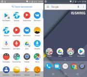
Android: You need to enable developer settings first. To do this, in the settings you need to open the "About phone" item, in which you will need to make seven quick taps to the "Build number" line. For smartphones with firmware from Xiaomi, the same should be done with the line "MIUI version". You will have access to settings for developers, in which you will need to select the "Simulate anomaly" item, and set the monochrome mode there.
Speaking about computer graphics in general, it is customary to subdivide it primarily into three-dimensional and planar. In turn, plane graphics are usually subdivided into two different classes: raster and vector.
These two types of images are built according to completely different laws, and, accordingly, different programs are used to work with them. However, in recent years, more and more programs use both types of graphics at the same time, since it is more convenient and more efficient to perform different tasks according to different principles.
Vector graphics- "computer" brainchild, because it has no analogues in the real world and appeared only with the emergence of computer technology. The closest analogue of vector graphics is usually called drawing, but this parallel is rather arbitrary: their similarity is more likely in the methods of work, the principles of constructing images.
If you look "deeply", then vector graphics are composed of separate objects-shapes, which as a whole form an image. Using separate geometric shapes and lines, we create a seamless image. Individual vector graphics objects, in turn, consist of individual points connected by straight or curved lines. The curvature of the lines connecting the points is specified by vectors- hence the name "vector graphics".
In fig. 1.1 you can see an example of a vector drawing - its appearance and "structure" of a drawing consisting of points and lines.
Rice. 1.1. Appearance (left) and the structure of the vector drawing (on right)
Raster graphics has a very accurate analogue in the real world - a mosaic. In bitmap graphics, an entire image is composed of individual elements called pixels... They are all the same size and shape, arranged in an orderly manner, and differ only in color. Due to the small size, the pixels are not perceived by the eye as separate objects, and we see only the whole image.
In fig. 1.2 shows an example of a raster image (for clarity, the fragment on the right shows a raster grid, according to which the pixels are placed).

Rice. 1.2. Appearance (left) and the structure of the bitmap (on right)
Such a construction of a picture - from individual fragments-pixels - allows you to work with it according to other laws than with vector graphics. To edit vector graphics, you need to move, create or delete individual objects, lines and points that make up the picture. The structure of raster graphics allows us to work with an image as with a real drawing, use tools that imitate real pencils, brushes, etc.
Speaking about the advantages and disadvantages of raster graphics (and comparing it, of course, with vector graphics), the following points should be noted:
Raster graphics are extremely sensitive to image resizing and are difficult to scale;
Changes made to raster graphics are not reversible;
Storing and processing raster graphics files requires large amounts of memory.
Those of our readers who have experience with graphic editors are probably already wary after reading these three points: their experience may contradict what has been said. To eliminate this seeming misunderstanding, we will analyze each point.
The fact that raster graphics are sensitive to resizing cannot be understated: this is the biggest and, unfortunately, unsolvable problem. When you enlarge a bitmap, the pixels that make up it grow with it. We said that the illusion of a whole image is related to small pixels - so as they get larger, the illusion becomes less convincing, and in the end we will not be able to focus on the whole image, since the large pixels will be distracting.
You can see a typical example of such an enlarged image in fig. 1.2: although the image in the picture is quite recognizable, it is simply impossible not to notice the huge squares of pixels, and such an image cannot be called beautiful. At the same time, the image in Fig. 1.1 looks neat, flat, and no pixels are noticeable.
Let's reveal a little secret: all The illustrations in this book are bitmap. In general, all illustrations in all modern books are bitmap - this is due to the printing technology itself. Vector graphics are used only for creating and editing images, and then, at a certain stage, they still become raster graphics - either when displaying on a monitor, or when printing. The image shown in Fig. 1.1 looks so beautiful only because the pixel size of this image is ten times smaller than that of the image in Fig. 1.2.
Vector graphics turn into raster graphics "at the last moment", and the mathematical formulas that make up the image, roughly speaking, are simply "calculated" with higher accuracy. Therefore, it is very easy to enlarge the vector image, and its quality will be still high (Fig. 1.3), and when the raster image is enlarged, the quality will certainly deteriorate, since individual pixels will become visible (Fig. 1.4).

Rice. 1.3. Vector image and its enlarged fragment

Rice. 1.4. Bitmap and its enlarged fragment
From this we can deduce that the smaller the pixels, the better for the image - and this rule is quite true (although, of course, as we will learn in Chapter 3, it makes no sense to reduce pixels to the size of an atom). If the pixels are too large, the image will look ugly and unnatural. This rule can be rephrased: the more pixels there are in the image, the higher its quality.
When resizing a bitmap, the graphics editor uses various mathematical techniques to compensate for the loss of quality when enlarged. We'll take a closer look at these technologies in Chapter 3.
The second point of our "claims" to raster graphics was that the changes made to the drawing are not reversible. Readers with experience in graphics editors will immediately think of undo commands - and they will be a little wrong. The irreversibility of actions is manifested primarily in the fact that after editing the bitmap (for example, painting everything green) and saving it, we will not be able to return to the original version later.
After saving, all changes made to the image remain in it forever - and if you deleted or "painted over" some part of it while editing, then you can say goodbye to it. The destroyed fragment cannot be “developed” or “pulled out” from under the paint layer, all information about it has been removed. The undo commands that graphic editors offer us have nothing to do with raster graphics itself. Instead of this the program itself"Remembers" our actions and can help restore the previous state of the image. However, as soon as we save the picture in a file, the graphics editor "forgets" about it, and it is no longer possible to recover this information.
This drawback becomes especially relevant if you worked with vector graphics. Since, according to its idea, a vector drawing consists of separate objects, its editing is almost always reversible - a displaced object can be returned to its old place, and if one object covers the other, then the lower, hidden object does not disappear anywhere, it is simply not visible.
As we will learn from the subsequent sections, with the development of vector graphics, raster editors adopted a similar approach - in professional programs you can store raster images on separate layers which will also be completely independent of each other - this, of course, greatly simplifies the work and compensates for the limited editing of bitmap graphics.
Finally, the last "gripe" with bitmap graphics was the large amount of memory they require. Indeed, there is nothing to be done about this drawback. We ourselves have deduced the principle that more pixels means better image quality. Information about each pixel (its color) is stored in the computer memory separately, and the more pixels, the more memory is needed for this. Large-format, high-quality images (such as wall calendars) can sometimes take up hundreds of megabytes... Add to this the "memory" of the program, thanks to which we can undo actions, and you will understand why professional designers are never satisfied with the amount of RAM in a computer and the size of hard drives.
But vector graphics are usually much more compact. The size of its files is determined not by the size of the image, but by its complexity - the more objects are used in the image, the more information needs to be stored. However, a rare vector drawing, even a complex one, takes even ten megabytes - usually they are content with much more modest values.
Chapter 2
Color theory
RGB color model
CMYK color model
Color model L * a * b
HSB color model
As we said before, a bitmap consists of individual pixels, and each pixel stores only one value: its own color. Therefore, it will not be an exaggeration if we say that the principles and methods of storing colors are the very essence of raster graphics.
When applied to computer graphics, the word "color" does not mean exactly what we used to mean in ordinary speech. In computer graphics, black is a color and white is a color and gray is the same color as green and red.
To record the color of a pixel, of course, digital values are used - in a computer, everything ultimately comes down to numbers. Accordingly, there are different color systems, which differ in the principles and form of recording information. The visible color is decomposed into separate "components", information about which is recorded. If it is necessary to display a color, the reverse operation is performed: the desired shade of color is “synthesized” from individual components.
Depending on the principle by which color information turns into a set of numbers, it is customary to distinguish color models, that is, some algorithms according to which you can write a color shade in the form of numbers, or vice versa - turn a string of numbers into color. Different color models, as we will see a little later, have different capabilities and are adapted to varying degrees to solve certain problems.
The main color models are:
RGB, "basic" in computer graphics, because according to this model, color monitors, scanners work - and most computer programs also "rely" on this system;
CMYK, the "mainstream" in color printing: inkjet and laser printers and even real printing houses work with this color system (or with its more advanced derivatives);
HSB (and its variants) is used to catalog and describe colors;
L * a * b, the most complex and most "scientific" of the color models, is used primarily for technical purposes.
These four color models are called full color, since they can describe a very large number of colors - tens of millions of shades. The human eye is usually unable to distinguish "adjacent" colors in full-color color models: if the colors differ by one or two numbers, then they will appear the same to us.
A large number of color shades require a lot of information, and the size of graphics files created or saved using full color color models will be very large. There are also simpler options for recording color, which require less information, even at the cost of limited capabilities and quality. Such color modes widely used, for example, on the Internet, where it is very important to keep the file size as small as possible. Color modes with "truncated" capabilities are called incomplete.
The main non-color color modes are:
Grayscale(Grayscale), which stores only pixel brightness information and ignores color;
Indexed Color(Indexed color), in which the number of colors ranges from 2 to 256 depending on the needs of the image and the balance between "economy" and quality;
Monochrome(Monochrome), which uses only two colors - for example, black and white, even without intermediate shades of gray.
Depending on the graphics editor we are working with, the names of the color modes may differ, or they may not be presented in the full range, or even new types may be introduced (for example, the 16 color mode is one of the "standards" in web design) ... However, the principles of construction and operation of color models and modes are unshakable and do not depend on the whim of the developer of a particular program.
RGB color model
The basic idea of the RGB color model is already in its name, which is formed from the first letters of the English color names: Red, Green and Blue (red, green and blue). Any color can be "decomposed" into these three basic components and re-obtained by "mixing" the base colors in different combinations and with different intensities.
As a "practical" illustration of the principle, an analogy can be made with multi-colored lanterns or lamps that illuminate a white background. Without lighting, the background will be dark (black), and depending on which color you light it with, the background may appear red, green, or blue. When illuminated by two "lanterns", new colors will appear at the same time, and if the brightness of the lanterns is not the same, intermediate shades are formed. Finally, if you turn on all three lights, the background will turn white (when all three primary colors are mixed).
In fig. 2.1 shows the color mixing schemes in the RGB color model - color (duplicated on the color insert of the book) and a schematic version.

Rice. 2.1. RGB color model scheme
When recording color information in the RGB model, the color is divided into three components and the brightness, or intensity, of each component, that is, each of the primary colors, is preserved. Usually the intensity of each color is calculated from 0 to 255 (256 gradations), but sometimes this number is even increased.
Using the standard version of the RGB model, we can write some color something like this: R: 255 G: 150 B: 0. This means that to get the color we recorded, it is necessary to use red with maximum intensity, green - a little more than half, and blue is not required at all. From fig. 2.1 we know that mixing red and green will give us yellow; and since the green component is represented in our color with a lower intensity, it will not be a pure yellow, but with a noticeable red tint. Probably, all readers have already guessed that the numbers we have given correspond to some kind of orange shade. Similarly (only, of course, more complex and accurate) are obtained in the RGB model and all other colors.
The process of mixing primary colors and displaying intermediate shades is shown in the video tutorial "RGB color model", in which you can see not only how colors interact, but also how an image is "composed" of individual color channels.
The RGB color model is widely used in computer graphics for the reason that the main information output device (monitor) works in this particular system. The monitor image is composed of individual red, green, and blue luminous dots. Looking at the screen of a working monitor through a magnifying glass, you can see individual colored dots - and it is even easier to see this on a TV screen, since its dots are much larger.
CMYK color model
After reading the previous section and getting acquainted with the laws of the RGB color model, readers may be surprised: how many times in childhood they mixed all the colors together, but white did not work. And it is no coincidence that we cited the example of lanterns illuminating a white background. RGB color model can only be used when mixing colors lighten each other - just as it happens with luminous points on a monitor or streams of light from lanterns.
When printing or painting, inks darken each other. Therefore, adhering to the principle of dividing color into three components, other primary colors are used - bright and light. In the name of the CMYK color model, the first three letters represent the colors Cyan, Magenta and Yellow (cyan, purple and yellow).
Note
Unlike RGB colors, CMYK colors are often referred to by English names and not translated. The reason for this is simple: the word "lilac" can mean many different shades, while the word "magenta" means a very specific, "typographic" shade of color. Therefore, in the Russian-language literature you can see the English spellings of flowers or their transliterated versions - "cyan" and "magenta" (yellow remains yellow, you can't think of anything here). Old school typographers call colors in Russian: red, yellow and blue (although by red they mean, of course, the color magenta).
According to the changed principles, the color model scheme will look different: instead of a dark unlit background, we will take white “paper” and apply paints on it, which, darkening each other, eventually form a black color.
In fig. 2.2 shows the color mixing schemes in the CMYK color model - color (duplicated on the color insert of the book) and a schematic version.

Rice. 2.2. CMY color model scheme
In the caption to Fig. 2.2 it is no coincidence that the color model is called CMY, since so far we have used only three colors. Although, in principle, all colors can be formed by mixing three base paints, in practice an additional, fourth color is used - black. There are several reasons for this, and we will not cover them in detail (this topic is more suitable for specialized printing articles and instructions). We will only mention that printing in three colors turns out to be expensive (a very large consumption of colors for text or black graphics) and difficult (an exact balance of three colors is required, otherwise black and gray colors will not turn out "pure", but will have a shade of one of the primary colors ).
So, when printing, four inks are used, and the letter "K" appears in the name of the color model - it means black, which is denoted by the letter "K", not "B", so as not to be confused with the color designation blue ...
Note
There are at least two popular explanations for why black is represented by the letter "K". According to one version, this is the last letter in the word "black" (the first letter "B" is not used for the reasons already mentioned). According to another version, the letter "K" is the initial letter of the word "key". "Key color" means "key color" - after all, without black it is almost impossible to achieve the correct display of colors in print.
When recording color in the CMYK model, a range of values from 0 to 100 is usually used (although programs and devices usually still count from 0 to 255). This is due to the fact that the CMYK color model is many decades older than computer graphics, and the balance of colors in it is traditionally measured as a percentage. Color recording in CMYK model might look like this: C: 100 M: 0 Y: 50 K: 20. Accordingly, to obtain a color, you need a maximum of blue paint, half the rate of yellow and one-fifth of black. Referring to Fig. 2.2, we can guess that mixing blue and yellow will give green (in our case, green-blue, since there is less yellow paint), but adding black will make the final color darker.
The formation of intermediate colors from the primary and the role of black in printing can be clearly seen in the video tutorial "CMYK color model".
The CMYK color model is used in printing - from the simplest printers to real printing houses. In some cases, more colors are used (for example, there are high-quality six- and even eight-color printers), but all color systems with additional colors are built as if "based on" the CMYK model.
Color model L * a * b
The L * a * b color model is rarely used in design, although it is constantly used by programs and devices for technical purposes. For a person, it is inconvenient, since it is difficult to visualize it; for computers, however, this limitation does not exist, and they easily use this model in various calculations.
The peculiarity of the L * a * b color model is a rather complex construction: it separately records the color brightness and separately - the actual color information. The letter "L" in the model name stands for "luminance", and "* a" and "* b" are the so-called chromatic coordinates, which determine the shade of a color. Since this model does not have "primary" colors, the individual values in it are called coordinates - they seem to indicate the position of the color in an imaginary three-dimensional space.
While the RGB and CMYK models used values between 0 and 100 or 0 to 255, then the L * a * b model uses mixed calculus. The L coordinate is usually measured from 0 to 100, and the chromatic coordinates are in the range from -128 to 127. The L coordinate refers to the brightness of the color, and each chromatic coordinate shifts the color towards one of the base colors: the * a coordinate adds a tint of green to the color ( negative values) or purple (positive values), and the * b coordinate is a shade of blue or yellow. At a value of 0, chromatic coordinates have no effect on the final color.
In fig. 2.3 shows the schemes for recording colors in the color model L * a * b - color (duplicated on the color insert of the book) and a schematic version.

Rice. 2.3. L * a * b color model scheme
Of course, this explanation looks complicated. However, the value of the L * a * b model is not at all ease of understanding or usability. Its value is that the laws by which it is built allow you to measure color with incredible accuracy - in the end, the values of the coordinates of the model are associated with the length of the light wave and the spectrum of light. Of course, this requires special devices - however, once the measured color will be known to us for sure.
The color model L * a * b is considered absolute, while all other models are relative, because in them, due to imperfect technologies and equipment, color cannot be measured with absolute accuracy. Thus, the L * a * b color model serves as a kind of standard by which you can compare colors and which you can orient yourself.
For the same reasons, the L * a * b model is used as an "intermediary" in the coordination of devices working with different color systems. Conversions from one color model to another (for example, from RGB to CMYK) always are performed with an intermediate conversion to the L * a * b model - so the result is more accurate.
HSB color model
As a kind of "compensation" for the L * a * b model, which is convenient for computers and inconvenient for people, the world of computer graphics includes the HSB model, which, on the contrary, is convenient for people and inconvenient for computing. Therefore, as a rule, the HSB model is used as a kind of "interface" in cases where it is important to present the selection or editing of color as clearly as possible.
Designed for cataloging colors, the HSB model is not tied to any real process, it does not use the separation of color into basic components. Instead, the HSB model separates color into simple and understandable components: hue, saturation, and brightness. This makes editing and color selection simple and intuitive.
In fig. 2.4 shows the schemes for recording colors in the HSB color model - color (duplicated on the color insert of the book) and a schematic version.

Rice. 2.4. HSB color model scheme
The H coordinate (shade of color) is represented in the HSB model as a "looped" band of the spectrum, or rainbows - with a little liberty in the form of turning purple back into red. The hue of a color is, as it were, a basic characteristic, which is then corrected by changing the saturation and brightness of the color. With this system, it is much easier to select colors that are similar in brightness or saturation: you only need to change one color parameter, and not all at the same time.
Coordinate values are recorded in various forms. In some cases, all three parameters are measured in the "computer" tradition - from 0 to 255. Sometimes a band of the spectrum closed in a "ring" is recorded in degrees, from 0 to 359 (as if the position of a color on a color wheel or ring), and brightness and saturation measured in percent from 0 to 100. The choice of the measurement system depends primarily on the convenience of its use in this particular case.
In addition to the HSB name, you can find the same color model under the names HSL or HLS. In this case, instead of the word “brightness”, the words “luminosity” or “lightness” are used, which, however, mean almost the same thing.
Grayscale color mode
In cases where we are working with a black and white image and there is no color information or it can not be saved, we can use the color mode Grayscale(Grayscale), which stores only the image brightness information.
In most cases, information about the brightness is recorded in the range from 0 to 255 - such a range of values is enough for the neighboring brightness shades to be practically indistinguishable by the eye and an ordinary person could not notice the difference between brightness number 133 and brightness number 134. It is no coincidence that in many full-color color models, each component is recorded in the range from 0 to 255: this is enough for the interval of brightness or intensity to appear continuous.
In fig. 2.5 (duplicated on the color insert of the book) is an example of a color image and an image converted to mode Grayscale(Shades of gray).

Rice. 2.5. Full color image (left) and a Grayscale image (on right)
Accordingly, less information is required to record the brightness, which makes it possible to reduce the file size and consume computer resources more economically.
Images in mode Grayscale(Shades of gray) are used in the preparation of black and white printed publications (newspapers, books) and, in some cases, in the design of web pages.
Indexed color mode
If you need to reduce the size of the file and at the same time keep information about the color, you can resort to the mode Indexed Color(Indexed color). Like the regime Grayscale(Grayscale) Indexed Color mode allows you to store up to 256 individual shades - but this time not fixed luminance values, but any color. In many cases, the number of colors is further reduced: mode Indexed Color(Indexed Color) stores 2 to 256 colors in an image.
Indexed the color is named because each file of this mode has a sort of "table of contents" ("index" in English) attached to it. Information about which colors are used in the image is stored in a special color table, and when saving the image itself, a "link" to the desired color in the color table is simply used. Thus, it is not necessary to save the complete information about the color in the image every time. Having entered it into the table once, in the future we can indicate this color as "color No. 25" or "color No. 187".
In fig. 2.6 (duplicated on the color insert of the book) is an example of a simple image with a few colors, ideal for converting to indexed color mode. Additionally, the figure shows the sixteen-color index of the image - that is, the colors used to describe it.

Rice. 2.6. Indexed Color Image (left) and the Adobe Photoshop window showing the colors used (on right)
Using indexed color mode is especially important when not all of the color gamut is involved in our image - as in the example shown in Fig. 2.6, left... If there are many different shades in the image, then when converting to the indexed color mode, some of them will have to be "lost", which will reduce the image quality and the difference between adjacent shades will be striking. In fig. 2.7 shows an image with a large number of smooth color transitions, which do not allow converting the image to an indexed color without losing quality.

Rice. 2.7. Full color image (left) and the image is in indexed color mode (on right)
To compensate for color distortion, a special technique called "Dithering" is used. It is performed by graphics programs automatically when converting images to other color modes (with a small number of colors), and its essence is that pixels of different colors are "mixed" for imitations missing intermediate shades. This allows you to smooth out and mask abrupt changes in shades to some extent (Fig. 2.8).

Rice. 2.8. Full color drawing (left), drawing in indexed color mode without using blending (in the center) and using blending (on right)
Indexed color images are widely used on the Internet: one of the two most common image formats in web graphics (GIF89a format) is the color indexed format.
Color Mode Monochrome
The simplest and most primitive color mode - Monochrome(Monochrome), which uses only two colors. The name "monochrome" implies one color (mono - "one", chroma - "color"), but the second is like a "background" on which we paint with one color. Usually black and white are used, but sometimes other combinations can be found.
Note
In Adobe Photoshop we will not find a color mode called "Monochrome", it will be called "Bitmap" - this is because one bit of information is enough to record information about each pixel.
In monochrome mode, you can save drawings, diagrams, text information, drawings in the graphics technique - in a word, all images in which high quality is not required and which need to be reduced in volume (Fig. 2.9).

Rice. 2.9. Monochrome images
When converting to monochrome, dithering must be used to simulate tints. Without mixing, the result will not only be ugly, but possibly unrecognizable. When mixing, you can achieve not only a recognizable, but also an original looking image (Fig. 2.10).

Rice. 2.10. Monochrome image without blending (left) and using blending (on right)
Monochrome images are very important, but they are important not for the designer, but for the printing process. Inkjet and laser printers, printing houses use monochrome printing (ink or toner cannot be lightened and grayed out), and, looking at the page with the printed image, it is easy to notice that it consists of white and black dots. At the same time, different techniques for obtaining intermediate shades are used, which do not coincide with the color mixing technique offered by Photoshop, but the principle remains the same.
Chapter 3
Image dimensions
Physical image size
Logical image size
Permission
To understand the principles of working with bitmap graphics, it is important to understand the size of the image - just as important as knowing the theory of color. Just as an incomplete color image limits us in expressive means and sometimes does not allow us to fully convey all the nuances of a drawing, a small image size will not allow us to convey small details of a drawing or prevent us from using it at a large size.
To complicate matters, the bitmap has two different sizes. On the one hand, on a monitor screen or on a sheet of paper, an image can be measured with a ruler and the size in centimeters can be obtained. On the other hand, there is the pixel size - it determines the number of pixels in the image.
The size in pixels is usually called physical size Images. This is a solid, unshakable value that accurately describes the image, such a size is absolute.
The size in centimeters, millimeters and other linear units of measurement is usually called logical size, since it describes only the momentary state of the image - the size with which it was now displayed on the monitor screen or printed, and this is the size relative.
Both sizes are related to each other by a third quantity, which is called resolution.
Physical image size
The physical size of an image is the number of pixels in the image in width and height. Thus, we get the dimensions of the image in pixels.
The more pixels in the image and the larger its physical size, the higher the image quality can be. With more pixels, we can preserve finer image details that would not be visible with less. Since a pixel is the smallest detail in an image, details smaller than 1 pixel cannot be preserved in the image.
In fig. 3.1 shows two images with different physical dimensions, and you can see how fine details disappear in the smaller image.

Rice. 3.1. Bitmap 55? 60 pixels (left) and 550? 600 pixels (on right)
It should be emphasized that although the size of the image in pixels can be changed (using a graphics editor), it is impossible to improve its quality and "show" the missing details. Insofar as all information about the image is recorded in pixels, with an increase in their number there is simply nowhere to take new information. Thus, it is very important that the image contains a sufficient number of pixels already at the stage of creation or digitization.
It is impossible to calculate the necessary and sufficient number of pixels in an image once and for all. Strictly speaking, it depends on how the image is going to be used - a large poster needs a large image, while a picture in the corner of a website needs a small image size.
However, it is much easier to reduce the image than to enlarge it: in this case, you just need to get rid of unnecessary information, and not "invent" non-existent information and somehow restore small details of the picture. Therefore, if we do not know in advance the future dimensions of the image or cannot calculate them accurately enough, we should make a margin upward: digitize or create an image with the maximum possible physical size in order to then reduce it if necessary.
Logical image size
The logical size of an image, measured in centimeters, millimeters, or other units of length, is relative. The image can be easily enlarged or reduced on the monitor, printed with a larger or smaller size.
The unpleasant fact is that when you increase or decrease the logical size of the image, the pixels also increase and decrease. By increasing the logical size of the image, we break the illusion of "wholeness" of the picture, since the pixels become visible. In fig. 3.2 shows how pixels grow larger and more visible when the logical size of the image is increased.

Rice. 3.2. Image with original logical size (left), with increased 3 times (in the center) and a slice of the image with a logical size, enlarged 9 times (on right)
As a rule, a slight increase in the image takes place practically without a trace. However, when magnified by two or more times, the pixels become clearly visible, which visually reduces the image quality. The lack of details in the image becomes noticeable, the illusion of integrity is violated.
As with changing the physical size, reducing the logical size is much less of a problem, although the image will still suffer: fine details will become indistinguishable.
Permission
A quantity called "resolution" is the "link" between logical and physical size. It determines the relationship between them and allows you to judge the quality of the image.
By measuring resolution, we are actually measuring the size of one pixel. Since this size is very small (unless, of course, we are trying to achieve high quality and the illusion of a solid image), it is not customary to measure it in fractions of a millimeter. Resolution is measured in pixels per inch, or 36 per centimeter, which is how many pixels you need to line up to make up one linear inch (or centimeter). Resolution is denoted by the abbreviation ppi (pixel per inch, that is, "pixels per inch") or - for the resolution of the printing device - dpi (dots per inch, "dots per inch").
Note
Pixels per inch is more common because computer graphics have developed most rapidly in the United States, where the metric system is relatively rarely used.
Resolution determines the quality of the image. If the image is with a resolution of 1000 ppi, then the pixel size is incredibly small - one thousandth of an inch - and it will be simply impossible to see it with the naked eye. This means that the illusion of integrity will be very good and the image may contain very, very small details. If the resolution of the image is 10 ppi (pixel size is one tenth of an inch, about a quarter of a centimeter), then the quality of such an image will be very low; to maintain the illusion of integrity, it will have to be viewed from a very long distance.
However, resolution, like logical size, only makes sense in a specific situation. By increasing the logical dimensions of the image, we increase the pixels, and therefore, decrease the resolution. Conversely, increasing the resolution, we decrease the size of pixels, and therefore, reduce the logical size of the picture. Therefore, the resolution is not fixed for the image, it, like the logical size, can be flexibly changed when printing or viewing the image.
Nevertheless, the resolution can and should be used to control the image quality. By enlarging or reducing the image, we can find out its current resolution and understand in advance whether such a picture will look good. If the resolution is low and raises concerns about the future quality of the picture, then we can take measures in advance to correct the situation: reduce the image or choose another one with a higher quality.
It makes no sense to seek "outrageous" resolution values, since any device has its own resolution. The monitor cannot show a half-pixel dot or half of the dot luminous on the monitor. Likewise, printers cannot print a point less than a certain size. One of the standard parameters of any output device is its resolution - in ppi (pixels per inch) for monitors, in dpi (dots per inch) for printers.
However, even if the instructions for the printer indicate a resolution of 600 dpi, you should not assume that an image with a resolution of 500 ppi will be inferior in quality. There is a concept of the effective resolution of the device, and if for the monitor it exactly corresponds to the "declared" resolution, then for printers it should be reduced. The reason for this is that the printer must put multiple dots to achieve color tints (similar to the blending technique we discussed in Chapter 2).
When assessing the quality of the future image, it is necessary to be guided by the table. 3.1, in which we provide approximate values for the effective resolution of various devices.
Table 3.1. Approximate values of the effective resolution of various devices
In general, it should be said that although the effective resolution of digital photography and printing presses exceeds 300 dpi, in most cases higher resolution images are not produced. A 1/300-inch pixel is virtually invisible to the naked eye and higher values are unnecessary unless you plan on viewing the printed image through a strong magnifying glass.
Chapter 4
Graphics file formats
There are many different file formats for storing bitmap graphics. Among them there are both universal formats that are not tied to any specific program, and specific "personal" formats of raster editors. And if we are not interested in the latter, with the exception of the "personal" format of Adobe Photoshop, then we should get acquainted with the most common universal formats.
Different formats offer different possibilities for saving files. There are various compression technologies, that is, reducing the size of a file - and when saved in different formats, its size can change significantly. In addition, certain graphic formats offer additional capabilities, such as saving transparent areas in a file (which is important for images in web design or pre-made images for collage), including additional color channels, vector objects, etc.
The most common generic formats are BMP, GIF89a, JPEG, PNG, and TIFF. Of course, the choice of formats in most programs is not limited only to the most common ones, and professional graphic editors can open or save files in dozens of different formats. However, as a rule, this is only required when transferring work from designer to designer and from program to program - and even then in most cases they try to adhere to proven common formats, problems with "understanding" which are unlikely to be another program.
Note
Comparing graphic file formats, we will also mention support for specific functions and additional parameters of Adobe Photoshop, which may not yet be familiar to the reader. This information should also be regarded as a reference and, if necessary, refer to it when further studying the program.
BMP (BitMap Picture) format Is a very simple and widespread format, but its capabilities are rather modest. In BMP format, you can save a flat (no layers) image in monochrome, indexed, black and white (in Grayscale(Grayscale)) or color (RGB model) mode. BMP format does not allow any additional elements to be included or transparency.
RLE (Run-Length Enconding) Subformat, sometimes presented as a "separate" format with the RLE extension, and sometimes - as a variant of the BMP format, 40 allows in addition to use simple compression, which can slightly reduce the file size.
GIF89a (Graphic Interchange Format) Is one of the two most common formats used on the Internet. Since small file sizes are essential for placing files on the Web, GIF is limited to 2–256 colors per image. One of 256 GIF colors can be set to transparent, which allows you to overlay images on a web page one on top of another or over a background image.
When saving a file, the built-in LZW compression is used, which can reduce the file size by 20-40% depending on the image. The format settings include an interlaced upload option, which allows you to get an idea of the image before it is fully loaded - this allows you to interrupt the download of unnecessary images and save time. A schematic representation of the interlaced download process is shown in Fig. 4.1.

Rice. 4.1. GIF interlaced download: intermediate stage (left) and the final image (on right)
GIF format can also create frame-by-frame animation, which is widely used in animated images for the web.
JPEG (Joint Photographic Experts Group) format Is one of the most common formats. It is widely used on the Internet and in any situation where you need to save an image by reducing its size. The JPEG format allows you to greatly reduce the size of the image (tenfold) due to lossy compression... The image saved in the file will differ from the original: its quality will slightly decrease, but the gain in the file size often allows you to put up with the deterioration in quality.
Attention!
At low compression, JPEG may have no visible effect on the image, but the image quality degrades always, even if it is not visible to the naked eye. JPEG should not be used as a “working” file format, as the quality will deteriorate more and more with each subsequent save.
By saving in JPEG format, we can choose the compression ratio of the image; the higher the compression ratio, the stronger the distortion in the image and the more its quality will drop (Fig. 4.2).

Rice. 4.2. Full quality image (left) and saved in JPEG format with medium (in the center) and low (on right) quality
JPEG compression works best of all on blurry, fuzzy areas of the image that do not contain sharp edges and contrast transitions. Therefore, you can save images in JPEG format only in the modes Grayscale(Grayscale), RGB or CMYK - that is, full color images.
As an additional option, you can save a "progressive" JPEG file, which will be progressively rendered in the Internet browser window, just as an interlaced version of a GIF file is shown. However, not all browsers render such images correctly.
The JPEG format does not allow saving any additional elements (layers, additional channels) due to the saving of file size. It is also impossible to implement transparent image areas in it.
PNG (Portable Network Graphics) format exists in two flavors: PNG-8 and PNG-24.
The PNG-8 subformat serves as a "replacement" for the somewhat outdated GIF format, practically duplicating its functions, but offering a more perfect compression mechanism, and therefore a smaller file size.
The PNG-24 sub-format allows you to save images in RGB mode and use "smooth" transparency with the ability to create semi-transparent areas (the GIF format does not allow this). However, despite a good compression mechanism, PNG-24 files are significantly larger than JPEG files, which has delayed the development and popularization of the format.
TIFF (Tagged Image File Format) Is a professional format designed primarily for storing high quality images. An interesting feature of the TIFF format is some freedom in its interpretation: different programs support different additional features. Unfortunately, this is also a disadvantage: additional features can make the file "incomprehensible" to another program and will not allow you to open it.
The TIFF format saves images in any color modes, you can include additional alpha channels in it, it allows you to store one vector outline (to create a curly border of an image when placed in a layout and layout program). Some programs can save transparent areas and even layers in the image, although this is not a standard setting and will probably create problems when opening the file in another program. In addition, the TIFF format allows you to save files without image compression or using one of the algorithms:
LZW is a common compression algorithm that allows you to achieve compression by 20-40% without loss of information;
ZIP is a built-in algorithm of a well-known archiver program that allows you to achieve compression by 30-50% without losing information;
JPEG - built-in JPEG algorithm that allows you to combine the greater capabilities of the TIFF format and JPEG compression with loss of information (and quality);
CCITT is an algorithm used in the fax transmission protocol to compress two-color images.
Attention!
Not all programs support one or another TIFF compression algorithm, so the use of compression is fraught with the impossibility of opening the file in another program.
Finally, PSD (PhotoShop Document) format Is a specialized format of the Adobe Photoshop program that allows you to preserve all the elements of the design created in the program with ideal quality. Thus, the file remains fully editable, and this makes the PSD format the only one that can be recommended as a "working" one: keeping the intermediate stages of work in this format, you can not worry about the loss of quality or the impossibility of subsequent editing.
Due to the ubiquity of Adobe Photoshop and the actual title of the "flagship" of raster graphics editors, many programs support the PSD format as an "additional" one and can open and save files in this format.
In cases where we are working with a black and white image and there is no color information or it can not be saved, we can use the color mode Grayscale(Grayscale), which stores only the image brightness information.
In most cases, information about the brightness is recorded in the range from 0 to 255 - such a range of values is enough for the neighboring brightness shades to be practically indistinguishable by the eye and an ordinary person could not notice the difference between brightness number 133 and brightness number 134. It is no coincidence that in many full-color color models, each component is recorded in the range from 0 to 255: this is enough for the interval of brightness or intensity to appear continuous.
In fig. 2.5 (duplicated on the color insert of the book) is an example of a color image and an image converted to mode Grayscale(Shades of gray).
Rice. 2.5. Full color image (left) and a Grayscale image (on right)
Accordingly, less information is required to record the brightness, which makes it possible to reduce the file size and consume computer resources more economically.
Images in mode Grayscale(Shades of gray) are used in the preparation of black and white printed publications (newspapers, books) and, in some cases, in the design of web pages.
Indexed color mode
If you need to reduce the size of the file and at the same time keep information about the color, you can resort to the mode Indexed Color(Indexed color). Like the regime Grayscale(Grayscale) Indexed Color mode allows you to store up to 256 individual shades - but this time not fixed luminance values, but any color. In many cases, the number of colors is further reduced: mode Indexed Color(Indexed Color) stores 2 to 256 colors in an image.
Indexed the color is named because each file of this mode has a sort of "table of contents" ("index" in English) attached to it. Information about which colors are used in the image is stored in a special color table, and when saving the image itself, a "link" to the desired color in the color table is simply used. Thus, it is not necessary to save the complete information about the color in the image every time. Having entered it into the table once, in the future we can indicate this color as "color No. 25" or "color No. 187".
In fig. 2.6 (duplicated on the color insert of the book) is an example of a simple image with a few colors, ideal for converting to indexed color mode. Additionally, the figure shows the sixteen-color index of the image - that is, the colors used to describe it.

Rice. 2.6. Indexed Color Image (left) and the Adobe Photoshop window showing the colors used (on right)
Using indexed color mode is especially important when not all of the color gamut is involved in our image - as in the example shown in Fig. 2.6, left... If there are many different shades in the image, then when converting to the indexed color mode, some of them will have to be "lost", which will reduce the image quality and the difference between adjacent shades will be striking. In fig. 2.7 shows an image with a large number of smooth color transitions, which do not allow converting the image to an indexed color without losing quality.

Rice. 2.7. Full color image (left) and the image is in indexed color mode (on right)
To compensate for color distortion, a special technique called "Dithering" is used. It is performed by graphics programs automatically when converting images to other color modes (with a small number of colors), and its essence is that pixels of different colors are "mixed" for imitations missing intermediate shades. This allows you to smooth out and mask abrupt changes in shades to some extent (Fig. 2.8).

Rice. 2.8. Full color drawing (left), drawing in indexed color mode without using blending (in the center) and using blending (on right)
Indexed color images are widely used on the Internet: one of the two most common image formats in web graphics (GIF89a format) is the color indexed format.
Color Mode Monochrome
The simplest and most primitive color mode - Monochrome(Monochrome), which uses only two colors. The name "monochrome" implies one color (mono - "one", chroma - "color"), but the second is like a "background" on which we paint with one color. Usually black and white are used, but sometimes other combinations can be found.
Note
In Adobe Photoshop we will not find a color mode called "Monochrome", it will be called "Bitmap" - this is because one bit of information is enough to record information about each pixel.
In monochrome mode, you can save drawings, diagrams, text information, drawings in the graphics technique - in a word, all images in which high quality is not required and which need to be reduced in volume (Fig. 2.9).

Rice. 2.9. Monochrome images
When converting to monochrome, dithering must be used to simulate tints. Without mixing, the result will not only be ugly, but possibly unrecognizable. When mixing, you can achieve not only a recognizable, but also an original looking image (Fig. 2.10).

Rice. 2.10. Monochrome image without blending (left) and using blending (on right)
Monochrome images are very important, but they are important not for the designer, but for the printing process. Inkjet and laser printers, printing houses use monochrome printing (ink or toner cannot be lightened and grayed out), and, looking at the page with the printed image, it is easy to notice that it consists of white and black dots. At the same time, different techniques for obtaining intermediate shades are used, which do not coincide with the color mixing technique offered by Photoshop, but the principle remains the same.
Smartphones with two screens: why?
Mobile phones with two screens appeared in the nineties, and the first devices of this format were the well-known "clamshells". With the advent of smartphones, manufacturers have concentrated on creating touch monoblocks and have forgotten about auxiliary screens for a while. In 2017, everything changed: five large companies at once - LG, HTC, Samsung, Meizu and ZTE - presented a new product, marking the beginning of a new trend. ZOOM understands what dual-screen smartphones are on the market today and why they need an auxiliary display.
It would seem that there are not so many models with two screens, but upon closer examination, there are more than a dozen of them. We studied all the trends and identified five main groups: smartphones with an additional touchscreen color display, with a monochrome display, with an E-ink-based auxiliary screen, half-folding devices with two identical screens and modern clamshells.
Folding beds
The first clamshell phone was the Motorola MicroTAC, introduced in 1989, although it received a more familiar form factor only with the release of the upgraded version of Motorola StarTAC in 1996. And although candy bars completely dominate the market, clamshells are still sold and even evolve. At first, manufacturers began to add small screens to the back panel of phones, and when the devices began to "get smarter", equivalent touch displays appeared on both sides of the devices.
Samsung W2017
The Samsung W2017 is a good example of this design. It got two 4.2-inch Full HD displays, a Snapdragon 820 quad-core processor, 4GB of RAM, support for wireless charging and Samsung Pay, and so on. In a word, it is really a top-end clamshell. True, it is made for the Chinese market and is very expensive - about 20,000 yuan (180,000 rubles).
Foldable smartphones
Smartphones with two equivalent screens, once popular in Japan, have been around for a long time. First, manufacturers began to use QWERTY keyboards, then the keyboard began to slide out from the side, and then it was completely supplemented with a second display, as, for example, in the 2011 LG Dual Screen QWERTY Phone. Subsequently, the need for a physical keyboard disappeared and was replaced by a second screen identical to the main size and a folding design, when the smartphone resembles a horizontal clamshell. The hit of MWC 2013 was the NEC Medias W smartphone, but this concept never gained wide popularity in the world. In the future, such modifications were practically not produced outside Japan, and at the end of 2017, ZTE again decided to return to this idea, presenting the Axon M.

ZTE Axon M
The device has a modern filling, two Full HD-displays with a diagonal of 5.2 "each and a wide range of scenarios of use. When folded, to save power, the auxiliary screen turns off and the device looks like a regular smartphone, for games there is a special mode in which control buttons are displayed on one display, and the main action on the second. And finally, the desktop mode allows you to show the same picture on both screens, which is convenient for watching videos in a large company. In general, ZTE's interest in such a solution is quite remarkable, especially given the fact that Samsung has long been threatening to show its vision of a concept in which one large display will be divided into two, folding like Axon M. At first, this development was referred to as Project Valley. then Galaxy X, and now it has completely disappeared from sight.
Second E-ink display
The first idea to cross a smartphone and a reader was implemented in 2013 by the Russian company Yota Devices, which presented its own. The device differed from its competitors by the presence of a second display on the rear panel, similar in size to the main one, but made using electronic ink technology. This made it possible not only to use it as an e-book, reading the text with great comfort, but also to continue working even when the battery level dropped to the minimum.

YotaPhone 2
Electronic ink has significantly lower power consumption, so you can use such a device for longer than a regular smartphone. Following the first version of YotaPhone in 2014, and then the company was sold to the Chinese, who presented themselves in 2017 on their own, not yet available on the Russian market. At one time, a similar model called Zero 2 was going to be released by the Umi company, but then there was a rebranding in Umidigi and the plans, apparently, were abandoned.
Second monochrome display
Auxiliary touchscreen displays have practically supplanted monochrome ones, but at a certain period of time, manufacturers managed to experiment with them. At first, such technical screens appeared in clamshells, allowing you to see information about time, calls and messages without opening the phone, and then they were introduced into smartphones. One of the most interesting products that implements a similar idea is the Chinese Doogee T3, presented in 2016.

Doogee t3
The device combines a non-standard design with genuine leather inserts, good performance for less than 10,000 rubles, and an additional screen located on the upper end of the case. It is capable of displaying information about missed calls, notifications about unread messages, time, etc. Looking at such a screen, however, is not very convenient, and there is no brightness control, so Doogee has something to work on.

Highscreen ice 2
The domestic manufacturer Highscreen also distinguished itself here. On the back of his Ice 2 smartphone, there is also a small OLED auxiliary display that can show the time, weather, notifications and other similar data, automatically turning on at a set interval.
Second touch display
Perhaps the most promising concept in modern realities is the addition of an auxiliary screen to the main screen, but not monochrome, but a color and touch screen. The first idea of placing a narrow auxiliary display over the main one was implemented in 2015 by LG, presenting the flagship V10 (). Over the next two years, the South Koreans managed to release three more models: V20 (she too), Q8 and the "state-owned" LG X view.

Impressed by the concept, HTC showed its U Ultra using an identical solution in early 2017, followed by Meizu in July. Naturally, the Chinese did everything in their own way, installing an additional screen in the Pro 7 and Pro 7 Plus, not from the front, but from the back.

Meizu Pro 7
The embodiment turned out to be more interesting than that of LG, which has been exploiting one idea for the second year already, and HTC, which simply copied the concept from the Koreans. Moreover, the location of the two displays one below the other, even taking into account the fact that the camera is located on the side of the auxiliary one, inevitably leads to an increase in size. The Pro 7 does not have such a problem, in addition, the main screen is "frameless", so everything looks neat and modern. The only thing is that the question of the convenience of using the additional display located at the back is somewhat controversial: in order to look at it, the smartphone will have to be turned over with the front screen down.

HTC U Ultra
Regardless of the location of the second display, its purpose is similar for all models: it is an additional screen for displaying all kinds of notifications, time, weather, charge level and other information that can be displayed at the moment when the main display is turned off. Other application scenarios include controlling the audio player, displaying the most frequently used contacts or camera modes. Meizu in its Pro 7 also proposes to use an additional display to view the image when taking selfies on the rear module.
* Recommended to upload a 720 * 312 image as the cover image
Article Description
Good day to all ladies and gentlemen! Whether only people with visual impairments (color perception) need to optimize the display of information on the smartphone screen. I think no! I often come across a question about the capabilities of "Monochrome Image". Samsung with Amoled screens has such an option by default and it also serves as an energy saving function. So we will not leave them alone. We have this feature in our beloved Xiaomi "kahs, smartphones, and I will tell you" "not in secret" "- it can save in a critical situation. The battery runs out, but to the outlet, no matter how. All standard optimization is included, but this is not enough! What to do! ? Everything to the banal is simple. Turn on the "For Developers" mode (there are many taps on the MIUI version in the "About phone" section, then - Settings - Advanced settings - For developers ... "Simulate anomaly" - "Monochromatism" this is the choice of the interface color display mode for people with color perception problems and just what we want. Let's give our smartphone to live ... Absolutely everything is transformed into a "Black - Gray - White" "interface with minimal energy consumption. You can return an exquisite look. easily, after charging, back - in a sequential way. *** And now a little information about the capabilities of the "For Developers" mode in expanded form, what is what and for what. Android Developer Mode - General overview "Bug Report" - button inactive during normal operation of the device. "Password for backup" - the ability to protect full backups of smartphone or tablet data. The password is entered manually and created by the user himself. "Do not turn off the screen" - activating this action will cause the screen to be permanently illuminated while the device is charging. "Select environment" - two working environments are available for selection: Dalvik and ART. The latter is newer and is designed to improve the performance of applications and the device as a whole. "Enable HCI Bluetooth operation broadcast log" - the command is used to save all HCI Bluetooth packets in a file. "HDCP check" - this command is used to select the order of HDCP check (protection system from copying) "Process statistics (Running applications)" - performing this operation will allow you to keep statistics of running processes. Android developer mode - Debugging "Debugging via USB" - enables debugging mode when connected to a computer using a USB cable. "Deny access for debugging via USB on all computers on which you have logged into your account. ”“ Error reporting ”- the button is inactive in normal mode. When activated, the device will start displaying an option to send an error report in the menu. "Fake location" is an amazing function that can mask the current location of the owner with the gadget and give false coordinates. "Select an application to debug" - you can set certain applications to be able to debug them . "Wait for the debugger to connect" - the application is waiting for the debugger to connect normally. The button is inactive "Install via USB" - the function allows you to check for security applications installed via ADB / ADT. The button is inactive. "Log buffer size" - the function allows you to select the size of the log buffer. Android developer mode - Networks "Wireless monitors certification" - displays the certification parameters of wireless monitors. "Wi-Fi detailed log" - the function allows you to specify in RSSI log for each SSID. "Switch to mobile network" - when the button is activated, the function allows you to forcibly switch to the mobile network if the Wi-Fi signal is weak. "Always enable search for Wi-Fi networks" - the function allows you to enable or disable the search for Wi-Fi networks -Fi during data transfer, depending on the traffic volume. "Use outdated DHCP client" - the activated function allows you to use the DHCP client for Android 5.0, and not for the new version. "Do not disable data transfer" - the enabled function allows you not to disable the transfer data over a mobile network even with an active Wi-Fi connection (to quickly switch between networks) "USB Configuration" - select the default mode when connected via USB to a PC. Android developer mode - Entering the text "Show clicks" - when the button is activated, the point is displayed at the points of pressing on the screen. "Show touches" - visualization on the screen of pressing and gestures is carried out. Android developer mode - Drawing "Show ... update surfaces "- the windows are fully highlighted when they are updated." Show element boundaries "- provides display of the boundaries of the clip, field, etc." Writing from right to left "- displays the writing of texts from right to left for all languages." Animation of windows "- setting the scale animations from 0.5x to 10x. You can also turn off animation altogether. "Animation Transitions" - sets the scale of the transition from 0.5x to 10x. It is also possible to disable animation. "Animation duration" - you can set the animation speed of the gadget in the range from 0.5x to 10x. Animation can be turned off altogether. "Emulation of additional screens" is an interesting option that can emulate additional screens on the main physical screen of the device. By enabling this option, the user will see another screen that will duplicate the main one. The dimensions of the additional screen are configurable independently. Android developer mode - Hardware accelerated rendering "GPU-accelerated" - you can check the box and thus always use the GPU for 2D drawing. "Show screen refresh" - the checked box will highlight the screen area when rendering the GPU. "Show hardware updates" - enabling this function will highlight hardware levels in green when updating "Debug overlay" - this item contains three possible options for selection: 1) off; 2) show areas of overlap; 3) highlight areas of a certain color; 4) show the number of objects "Debug non-rectangular truncation operations" - at this stage, you can perform three actions: 1) disable the option; 2) non-rectangular section; 3) testing the command drawing green. "Enable 4x MSAA" - by checking the box, the user (or already the developer) enables 4x MSAA in OpenGL ES 2.0 applications. "Disable hardware overlays" - activation of the item will entail constant use of the GPU when composing the screen. " Simulate anomaly "- select the interface color display mode for people with color perception problems. Android developer mode - Multimedia" Disable audio transmission (USB) "- this function disables automatic routing of audio to external USB devices. Android developer mode - Monitoring "Strict mode is on" - this mode will highlight the screen of the Android device during long operations. "Show CPU load" - when this action is activated, the smartphone will display an additional window on its screen with a graphical display of the current CPU load. " Recording GPU operating time "- the name of this item speaks for itself." Enable OpenGL tracing "- has four possible scenarios: 1) no data; 2) Logcat; 3) Systrace; 4) Call list in glGetError / Android developer mode - Applications "Do not save actions" - this menu item refers to applications, activating it will delete the summary of actions after they are completed. "Background process limit" is a useful function. It is able to limit the number of running applications in the background. "All ANR" - the checkbox, placed in front of this item, will provide user notifications that the application is lagging (auth.) Or not responding. "Inactive applications" - a built-in manager of active applications with the ability closing. *** The "For Developers" menu overview is relevant for versions 6/7, but not all items are available in MIUI, it is worth considering.