New trends in web design. Texts and images colliding with each other
” by John Moore Williams, Head of Content Strategy at Webflow.
The end of the current year is just around the corner, and every web designer has asked himself at least once important issue: What will define web design in the coming 2017? I decided to find the answer to this question and asked WebFlow designers what trends they thought would dominate the next 365 days. I also gave my own comments to their thoughts.
First of all, let's get the opinion of Webflow's lead designer Sergie Magdalin.
1. Content-Driven Design
“The arrangement of design elements within a given structure should be such that the reader can easily grasp the main idea without reducing his normal reading speed” -Hermann Zapf
The past few years have seen a dramatic shift in thinking about the role of design in business. Earlier design was seen as the final step in the process of creating an object: the designer-magician comes at the end and sprinkles magic dust on our product to make it better than the competition.
It was very interesting to watch the metamorphoses occurring with development priorities.
And the most beautiful thing about these metamorphoses was the transition to a model where content again stands at the head of the table. Designers around the world have realized that users visit websites primarily for the content, be it short tweets, long-form specialized articles, or the latest Internet memes. The ultimate role of design is to present content in the most attractive, understandable way and get the best results from it.
This is one of the reasons for the transition from “skeuomorphic” design (when elements are depicted as similar as possible to their counterparts in real world) to a flat, minimalist design. From these considerations, Google created Material Design.
Of course, as Newton's third law states, for every action there is an equally strong reaction. Many designers believe that the fashion for flat design has “killed” the very spirit of design. We expect this debate to continue in the coming year, but the focus will remain on content - the basis of any design work.
2. High-quality interaction between designers and developers and designers among themselves
Design's importance in shaping business is increasing, so more and more emphasis is being placed on designers working together with their fellow designers and their fellow developers.
This concern for interaction with designers has arisen in part due to the massive volume of mobile and web applications that are being developed today. In addition to the fact that such giant corporations as Google, Facebook, Twitter and LinkedIn require the titanic work of a design team with absolutely different sides, designers need to always be on the same page with each other. This means there is a need for greater communication on the project and how to most effectively collaboration.
To make this task easier, many tools have been created, from collaborative templates and boards in Webflow's Team to Figma, a graphical interface editor that shows changes in real time. I am sure that in 2017 these platforms will be improved and supplemented.
If we talk about the interaction between designers and developers, a lot of attention is paid to important process transfer of work. For example, instead of sending heavy and bulky static images, designers can now share live rendered mockups thanks to tools like InVision, Marvel, UXPin.
Carson Miller weighed in on this in his recent article “The Future of Front-End Design” on TechCrunch:
“Sooner or later, tools for creating designs and design patterns will completely replace front-end development. You can easily create a high-quality base for any of your frameworks without having to write code by hand.”
3. Simplified designer-to-developer process
The design and prototyping tools mentioned above allow you to visualize the various stages of collaboration through visualizations that range from animated Keynote files to fully functional websites. This method of sharing work material reduces response time within the project, thereby increasing the quality of the design, increasing the speed of the development team and reducing the possibility of disappointment with the result. It also improves customer interaction. For example, for many WebFlow users, client meetings have turned into full-fledged work meetings where designers can quickly implement ideas and everyone can test their ideas almost immediately.
Web design trends in the coming year according to product designer Gadzhi Kharkharov:
4. Large, loud headline
As the world of web design begins to focus on content, it's increasingly common to see inspirational headlines on websites with matching fonts that are as large and bold as their content.
The #MadeInWebflow Heco Partners
As you can see from the examples, “large” and “bold” do not only refer to the description of the font. Rather, it is about dedicating a significant portion of the home screen to a simple, but strong and self-contained statement about the product or service. Such a headline should contain the essence and be understandable for any visitor, avoiding unnecessary pomposity (okay, the phrase “Design the impossible” may sound too loud).
In today's busy, information-overloaded environment, short, powerful statements like these work well for any brand.
5. Complex markup that comes from the basics of graphic design
If we want to predict the development of web design (at least its visual side), we need to look at the history of graphic design.
In the past few years, web page layout has been limited to CSS, but new modules like Flexbox and CSS Grid(which will be released in March 2017), will allow you to implement the most daring ideas in web markup.
Our main task now - to understand how the new grid layout of blocks should work within the framework of adaptive design.
Here are some examples of what to expect (assuming you have a browser that supports CSS Grid, such as Firefox Nightly, Safari Technical Preview, or Chrome Canary):
Experimental Layout Lab Jen Simmons
Pay attention to the style of the main block - a clear reference to the history of graphic design.
Grid by Example
You can see more examples on the website.
6. More SVG
SVG (scalable vector graphics) vector graphics) has more benefits for web designers and developers than traditional image formats such as JPG, PNG or GIF.
The main advantages of SVG are described in the very name of the format - scalability and vector. Unlike raster- and pixel-based formats, SVG images are made up of vectors—mathematical descriptions of an object's shape. This means that SVG is resolution independent and images in this format will look great on any screen and device. There is no need to worry about images being blurry on the retina.
But that's not all. SVG is also famous for not requiring HTTP requests to be sent. If you've ever checked your website's loading speed, you may have noticed that these HTTP requests can really slow down your site. There is no such problem with SVG.
7. Tools for Rule-Based Responsive Design
Responsive design has completely changed the way we look at web applications and create them.
But, oddly enough, the principle of operation of design programs has not changed at all. Most of these tools work like this: you need to create a similar page again and again to various devices and permissions. In an industry where it is required fast generation ideas, fast development And quick start, such waste of time is simply unacceptable.
Expected new wave design tools (such as Figma) based on “rules” that adjust the appearance of sites on different screens and devices, thereby reducing the number of repeated designer actions. Such tools are based on the spatial relationships of elements and, as we change screen size or device, they strive to maintain these relationships by changing the sizes of elements and the padding between them.
By the way, today there are similar tools for website layout not only for designers, but also for ordinary users. For example, TruVisibility.com - the platform adapts the created design according to certain rules, according to which the layout and sizes of elements are adjusted to the screen size. All that remains is to make a few adjustments to ensure that the web page looks the way it should on devices. The user does not need to re-create the version for mobile devices, and this saves him a lot of time.
Design trends for 2017 according to Ryan Morrison, senior graphic designer.
8. More bright colors
When the era of minimalism and brutalism began in web design in 2016, designers tried to add more personality to their work without going beyond fashionable styles. And there are at least a few cases where bright and bold colors have been used very successfully.
Take a look at the new Asana site with a splash of color:
New icon Instagram apps received a lot of criticism, but this redesign undoubtedly refreshed the brand:
Everything Stripe does does not require a separate view:
As you can see, it's not just bright and bold colors. Gradients are also back in style, blending and blurring colors in shades reminiscent of a midday sky or a flaming sunset. It's something of a renaissance of naturalism with vibrant colors and bold gradients, and I personally look forward to seeing more of this kind of work in 2017.
Although, maybe it’s worth reducing the brightness a little? We're watching you, Asana.
9. More emphasis on animation
Animated elements have long played a key role in the web interface, and this trend will continue in 2017. In fact, as long as designers have access to tools to develop compelling animations, we will see these effects become more visible and more sophisticated.
This topic is especially important because animation creation is becoming easier every day. At the 2016 Design & Content Conference, animation guru Val Head emphasized that when designing animated elements, designers should keep the brand's goals and needs in mind to achieve the effect content creators expect. If this advice is heeded, the animation will perform tasks that are meaningful to the brand, and not just give the user a migraine.
10. Unusual markings
2016, like the previous few years, is famous for the endless discussions that web design is either dying or losing its spirit.
Those who are trying to convince everyone that web design is dead are clearly exaggerating. Many continue to look for ways to present content to users in new ways. One of the most tempting ways is to break the system and ignore the usual grid layout dictated by the rules of responsive design.
The “broken” marking method involves elements going beyond the meticulously aligned grid. Such techniques may sometimes even seem unpleasant to the eye. For example:
Texts and images colliding with each other:
Texts and images scattered (seemingly) randomly across the page:
This was the first part of the translation of the article “18 web design trends in 2017”. Do you agree with the opinions of Webflow experts? What kind of web design do you think will be in vogue in the coming year?
Given the active development of technology, our communication with the computer is becoming more and more natural, and the possibility of interactive communication using voice appears. Therefore the future is voice assistants, but this is the next generation of applications.

A call to action button should be a key element on any page. Nowadays, colors that are too bright and irritating are often used. But to emphasize the CTA button in 2017, it will increasingly be used simple animation, it is not so annoying, but it perfectly performs its function of attracting attention.
Remember that the main thing is not to overdo it! Use smooth movements in the animation after a few seconds; they attract attention without being too annoying. We recommend adding a call to action button to your website header to better effect. And not only on the website, add such buttons to your mailings too!

Large photos, and especially videos, always attract attention. Moreover, the video plot itself can truly interest the visitor.
If this background video, then you have two in one - it is both a photo and a video. Since videos are still used relatively rarely as backgrounds, they immediately arouse interest.
Strive to create PERSUASIVE videos. Real people in your video should create a feeling of authenticity, sincerity, and authenticity. Be sure to use different tactics: customer reviews, reasoned responses to possible objections, and product demonstrations.
With the help of such videos, you will be able to overcome any doubts of your clients much faster and close the deal.
Trend #4 for website design in 2017 – scrolling as the main type of navigation

In 201, scrolling had already become widespread. He made the information more meaningful. Now users will be happy to scroll through long texts, instead of following links and waiting for pages to reload.
Important information in the site header, such as the main navigation menu, phone number or button call back is fixed and always available without additional actions.
Scrolling helps to smoothly tell an interesting story, show a lot of photos, and thereby overcome user doubts and encourage conversion.
Well planned landing page takes customers on a carefully crafted journey that leads to conversion without forcing them to think twice about choosing a path.

Offer related and similar products, as well as profitable promotions during the checkout process to increase the average check. Related products in e-commerce account for 10 to 30% of income. Remember that selling to a new client is ten times more difficult than selling to someone who is already ready to pay.
With the help of a pop-up window, you can retain the client when he is about to leave the site. But a sense of proportion is very important here, since many users began to hate them.
But if you get creative with these notifications and don't ask for anything in return, such as offering free shipping, writing down a coupon code, or downloading a free trial version, then this approach causes irritation.
Lines, colors, light and shade, space and shapes are the elements that make up a painting. Each era had its own tendencies in representing the world. Web designers are the same artists, only they create in digital format. And if trends in art did not change so often, then web design is transformed from year to year. We will try to compile a guide to trends graphic design and predict how websites will change in 2017. You can read about web design trends of 2018.
So, 14 turns on the way to a fashionable interface:
1. Focus on content
What is more important: content or page design. The answer is simple - the design should present the content favorably. Designers of the WebFlow service (website builder) propose to end the struggle for supremacy in 2017, giving preference to content. A user visits a website looking for an answer to a query, whether it’s a product, a service, or a useful article. The web designer’s task is to present the content as conveniently as possible for a person.
2. Avoiding “hamburgers”
The small and convenient menu icon in the form of three stripes, which was nicknamed “hamburger” for its resemblance to fast food layers, is gradually losing its popularity. It's used too often. In 2017, experiments with navigation and unusual arrangement of menu sections, for example on a frame around the site, are encouraged.
3. “Card-based design”
Card web design has quickly conquered the Internet. The advantages of this design method:
- convenient arrangement of blocks on the site;
- visually advantageous presentation of content;
- adaptability for mobile devices.
To the question: whether card design should or should not exist in 2017, there is no unanimous answer. It will be used because it has already proven its effectiveness.
But block design is gradually losing its position as a favorite due to the “cluttered” nature of such an interface. Minimalism and flat design remain popular. Clear and convenient navigation elements without unnecessary maneuvers, the use of only a few colors in the design are time-tested techniques.

4. Broken mesh
This trend encourages designers to think outside the box. Try using a non-standard grid on the site - let the blocks “overlap” each other a little, and let the texts go beyond the usual boundaries.
Originality is always in fashion. Non-standard layouts and new approaches to graphic design Western designers have already tried it. The most daring solutions can be implemented using Flexbox and CSS Grid modules.
5. Catchy unusual fonts - typography bias
Large font has been one of the main elements of web design for several days now. The trend will only strengthen in the new year. The trend is handwritten inscriptions and icons stylized as handmade.
An excellent addition to the website design would be font graphics (if appropriate).
6. Responsive design
Website versatility for devices with large and small screens is no longer a new trend. Approach mobile first"is still relevant in 2017. In addition to the ability to adapt to mobile gadgets, in the near future sites should adapt to a specific user depending on:
- age;
- skills (competencies).
For example, fonts, brightness of colors, navigation will change depending on who visited the site: a pensioner, a preschooler, an Internet novice or a confident user. This will become possible thanks to the development of metadata.

7. Colors
Rich monotonous colors, their shades and halftones have moved from the trends of last year to this year. Designers continue to use gradients and create interesting transitions. By the way, if you can’t decide on the choice of color, take a closer look at the fashionable “Greenery”.

It resembles fresh spring greenery and will help add color accents to the site. Experts from the Pantone Color Institute named it the color of 2017.
8. Infographics
The technique is not new, but effective. With the help of infographics, any statistics on the site is transformed into a visually understandable picture with interesting content.

9. Animations
Static pages are boring. It is much more interesting for the user to “walk” around a site with animated icons. Draw attention with animation to those elements that are beneficial to you, for example, to the “Buy” button.
Use microinteractions so that the user sees a response to clicks, transitions, and confirmations on the site. Then mechanical actions will become interactive and attractive.
10. Background photos and videos
Animation is good, but wide-format background photos and videos for website design are even better. Video adds dynamics to a web resource and allows you to immerse the user in a certain story, look “behind the scenes” of the internal processes of a company or brand. Storytelling in web design is still relevant. Photo - illustrates, creating an atmosphere.
If you are tired of these elements, use cinemagraphs (a symbiosis of photos and videos). In such an image, only one element continuously moves smoothly, as if part of the photograph comes to life.

11. Stop “stock”!
Stock photos are found on every corner of the Internet, and this makes a site lose its personality. In 2017, the web gives preference to unique images.
12. Scrolling +
Scrolling has gained popularity thanks to mobile gadgets, from which it is more convenient to “scroll through”. But many people are annoyed by not being able to get to the bottom of the page. Among the trends of 2017 is the combination of scrolling and page navigation. Let the user choose how to view the content.
13. Parallax scrolling
In 2017, the parallax technique (movement on different speeds background and front) will gain a new breath - the development of more complex multi-layer techniques. Experiment with parallax, captivate the person who visits the site with interactive elements. But do not overdo it so as not to confuse the user.
14. 3D panoramas
360° panoramas are another way to effectively demonstrate a product to the user or “give” the visitor the opportunity to be virtually present in some place, for example, in a company office or hotel.
.jpg)
These are the main web design trends for 2017. But don't focus only on them. Experiment, learn from experienced colleagues, and then your site will become original and understandable to all users. And we are always ready for you in this!
Every year we learn something new about design and 2016 is no exception. The article we wrote last year was such a success that we decided to make some predictions for 2017, so let's get started!
New article published →← Read and get inspired!Design trends are influenced by media, technology, the fashion industry and, in lately usability. The trend appears slowly, gradually, penetrating all areas of design, and then disappears in exactly the same way. Most design trends last no more than one or two years. Design in 2017 will continue the trends that started in 2016 with some new changes added, this feeling is well known and familiar and you may have noticed it in the last couple of years. The main influence remains Google's Material Design, with minor changes.
What trends in web design await us in 2017
01. Semi Flat Design
For the past few years, flat design has been the most popular in the web design market, but now, under the influence of Material Design, it is becoming more and more one-dimensional. This transition starts with some light shadows, making it a semi-flat design. The evolution of flat design from the minimalist style is moving into new developing technologies. The flat design is still there, but it has undergone some improvements.
Smooth shading adds depth and complexity without ruining the feel of the flat design. This new feature added to the flat trend and will continue to develop in 2017.
Project: Resource | UI/UX Tool for Web Services
Authors: Ruslan Latypov; LS Graphics; Anton Mishin; Valery Gurkov

 Project: Listener's Playlist
02. Moving photographs (Cinemagraphs)
Cinemagraphs are not those GIF animations that we see everywhere on the Internet. Cinemagraphs are still images with minor elements of movement. This technique makes a simple photo more realistic.


03. More 3D
3D is definitely moving in our direction and we will see this influence in all areas of design. With VR/AR technologies picking up pace quickly, this field is developing quite quickly.  Project: LUV.IT
 Project: Open Annual Awards
 Project: Air Max '17
 Project: NIKE F.C. | 3D Golden balls in the real world
 Project: Better You Brand
04. Animations
Animation is more and more present in web design, the format can be any - WebGL CSS, GIFs, SVG or video. Animation has been one of the most important web design trends of the past year, don't be shy about using it.

Project: Nickelodeon Kids Pick The President
 Project: AR Virtual Fitness Coach App
 Project: ZH OURO- Rio 2016
05. One-page sites/landing pages
In 2017, we will see the growth of one-page sites due to their potential for marketing purposes and their ability to better target visitors.
If you need a landing page, you can order it from me →
06. Geometric Shapes, Patterns, Lines and Circles
This trend started in 2016 and will definitely continue in 2017. You can personalize your site by simply adding some modern shapes, either flat or with a soft shadow.
 Project:
 Project: DRAP.agency Branding
 Project: Pfizer - Active and 50+ for The New York Times
07. Courageous Colors
Use bright colors to stand out. Material and flat design go well with bright colors. You can use color palette, presented by Google, to select and combine the colors you want.

 Project: Edris — Logo Designed by MiLo
 Project: Rendered - Responsive Demo Website for Adobe
 Project: b2mach
08. Innovative Scrolling and Parallax
This is great visual idea, which will add uniqueness to any site. From multi-layer parallax to video parallax, everything is possible with the D.ex Multilayer Parallax plugin. This product was developed entirely by the Milothemes studio under the direction of Loredana Papp and Mihai Baldean. It is available for purchase on Envato Market / codecanyon.net

This is a WordPress plugin that allows you to make beautiful Parallax blocks with more than one layer. Be creative and combine layers in any style you want. We made 12 various examples in the plugin guide to make your first acquaintance with the wonderful world of parallax easier. Play with layers!

09. Color Transitions
Gradients are one of the biggest trends right now. The trend began to gain popularity in 2016 and continues to grow rapidly after large brands, such as Instagram, decided to change their logo and images from one color to a multi-color transition (gradient). From logos to buttons or picture overlays, this trend is everywhere.

10. Mobile Browsing (Responsive Design)
2015 and 2016 saw a significant increase in views from mobile devices. Tablets and smartphones are now a higher priority for browsing websites, they are superior desktop computers and laptops - and this trend continues. Any website that does not have responsive web design need to update ASAP!
 Project: Responsive Website Animation
11. Custom Graphics and Illustrations
Stock photography is still quite popular, but a new trend has emerged in 2016 and will continue to grow in 2017: the use of custom graphics and illustrations. If you want a unique, beautiful website that any visitor will remember you, collaborate with digital designers. This means fewer stock photos and more original, unique images.


12. Creative Use of Neutral Space and Grid
In recent years, web design has been more inclined towards orderly, organized columns and grids, but in 2016 we could see a significant shift towards irregular layers and ultra-modern designs.

13. Tell stories (Storytelling)
Websites are now starting to tell stories to win over the customer. People tend to remember stories more than reading simple (dry) information.
More video about storytelling from Business of Youth:
14. Gradual loading of content (Lazy Loading)
Lazy Loading delays loading images on long web pages, allowing information to appear in certain point while scrolling down, which reduces page loading time.

15. Split Content
Split content is now popular in responsive web design; it is splitting the screen into 2 or more parts. Such a site split screen will show the viewer several equally important messages in one site block. This trend appeared in 2015, but in 2017 it will continue to grow and, most likely, you will see it on many sites.

16. Full-Screen Forms
There's no need to navigate to another page to fill out a form because new sites use full-width forms that adjust to your needs. responsive design.

17. Videos Everywhere
Video content has increased over the past year, and people have become more demanding of high-quality videos. A video on a website can be short and auto-repeat, showing a product or a large-scale cinematic project that will keep the viewer involved in the story.
 Project: Hillsong
18. SEO is important! (SEO is Important)
SEO is very important for a website, so a beautiful website without good SEO will remain an outsider.

19. Hidden Navigation
Hamburger menus create a lot of debate for and against how difficult it is for users to find the menu, but one thing is for sure - this trend is here to stay and people will eventually get used to such menus.

20. Tiny Design Details
Focus on details is very important this year. Small details such as navigation points, etc. Focus on small details will make the job complete.
 Project: Barometa - Next-generation Job Platform
21. Logo Design Trends
21.1. Minimalism
All big brands are moving towards simpler, minimal designs and this trend is here to stay.

21.2. Hand drawn
This trend has been in the spotlight for the past few years and this style is great for hipster businesses. It is used for hair salons (barbers), cafes, restaurants, art and craft items.
21.3. Negative space
This is an old trend, but we've seen it pick up steam over the past few years and will continue to grow in 2017, so it's definitely worth taking a closer look at.

21.4. Cropping
It doesn’t get more minimalist than this trend. It shows only what is enough to indicate in the logo to recognize the company, and nothing more.

21.5. Geometry
This trend is old school, but it's one of those styles that will never die.

21.6. Line art
This trend is popular among new generation businesses
 Authors: Sam Healy; Andrea Schlaffer; Jacek Janiczak
21.7. Patterns
Patterns are the new trend, and this repetition is an unusual way to make a business memorable and differentiate it from its competitors. This original direction can also be used in the presentation of logos.
 Authors: Nick Edlin; Stanislav Aleynikov; Lucas Gil-Turner
21.8. Animated logos
Motion design is a popular trend today, and we can see it in all areas of design.
 Authors: Javier Miranda Nieto; The Woork Co
21.9. Vintage
Vintage style is still in the game. Even if this trend has been popular for a long time, it still has something to say.
 Authors: Roman Dodonov; Mingo Ideas Up; Will Try Further
21.10. Color Transitions
Gradients are everywhere this year—and logos are no exception.
21.11. Illustrations in logos
Illustrations are a good way to create a unique and personalized logo for your business. They are becoming increasingly popular this year.
 Authors: Bodea Daniel; Jacek Janiczak
21.12. Photography in logos
The combination of pictures and typography is very popular now. They work very well together and it creates a contrast between them.

22. Typography Trends
22.1. Big, bold & beautiful typography
Typography may be the most important element in creating stunning design. This year the typography will be bold (bold) and large with prominent headings.

 Authors: Alexander Laguta
 Authors: Quim Marin
 Project: Baugasm Series - Pack 4
22.2. Gradients/color transitions in typography
Gradients are without a doubt a trend today, and you will find it in typography as well.

22.3. Visual hierarchy
Hierarchy in typography is important in any design direction. Font size and width can easily indicate which words or headings are prioritized, so use this factor when creating your texts. You should also remember that you can achieve a clear visual hierarchy through text placement and color.

22.4. Tiny Typography
Very small text is usually surrounded by an opposing color space, but you can create a visual difference between color or image to make the text stand out. You can also use animation to help your text stand out.


 Authors: Slava Oleinik; Bahaa Samir; Witty Digital
 Project: Baugasm Series - Pack 4
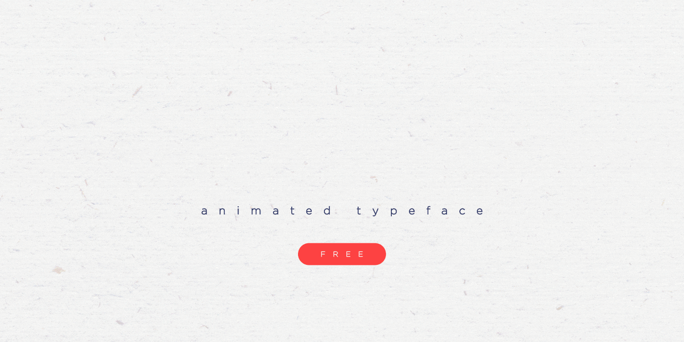
22.5. Animated Typography
Animation is used everywhere now, and typography is no exception. If you use motion software, you can't go wrong this year.
 Project: Gotham Pro Animated Typeface Free
22.6. Typography meets photography
The combination between text and photography can produce excellent results. Check out these great examples.


22.7. Geometric shapes and typography
Geometric shapes can work well with typography to create a beautiful design.


22.8. Font pairing
Use two or more fonts together. This is still trendy in 2017.

———————————

The article is divided into two main areas: graphics in web design and development itself, and each section has its own components.
WEB DESIGN TRENDS
So, we’ll start with the web design trends of 2017 and what awaits us in 2018. What changes have occurred in graphics, the use of fonts, animation and video, and so on.
Graphic design
The trend that is considered fashionable is Flat Design. Vector graphics are used with the addition of raster graphics for emphasis; examples of such sites are given below. Minimalism and responsive design, simple and understandable for site users.
 |
 |
 |
Vector images
The use of the vector on websites is increasing; it is lightweight, which means loading goes faster. Since the vector can be stretched and compressed as desired, your graphics will always look great on any device screen at any resolution. For vector images use SVG (Scalable Vector Graphics) format. Most vector editors allow you to save in this format and there is no need for specific software.
Colorless - ghost buttons
The move towards minimalism also influenced the design of the buttons. The use of this type of buttons in website design is increasing. Such buttons do not overload the site and look original. Our website also uses buttons like these below in the articles block.
 |
 |
 |
Click on the image to enlarge it
Stylish 3D graphics
3D graphics are also gaining momentum in the new year. 3D compositions go well with flat design and complement it, giving it more depth and emphasizing modernity.
Click on the image to enlarge it
Animation, video and interactive objects
Websites have started using live photos and backgrounds, this definitely attracts attention and gives the site some dynamics. There has also been an increase in the use of video and all kinds of animations for user interaction.


Complex meshes
Back in late 2016, a trend emerged for websites using dynamic, complex grids with cutting-edge design.

Geometry in different forms
Usage geometric shapes different types for text, informational highlighted blocks and backgrounds. Rectangles and squares are great for highlighting important things.
 |
 |
 |
Click on the image to enlarge it
Fashionable colors
Here who likes what, and what, by definition, is suitable for each project. The only thing that can be said is that the colors are becoming more vibrant. In combination and good contrast, it is more convenient for the user to navigate the site and perceive information.

Unconditional adaptation
Now there is no need to say that sites should be made friendly to mobile devices. Adaptation is an absolute factor of a modern website. It is very important to think through the design in the mobile version so that everything important elements were at the user's fingertips, and he intuitively understood the site navigation.

Disputes do not subside as to whether it is better to put an icon or an inscription. Test results on 240,000 mobile device users.

Mobile Menu Alternatives
If there are not many sections on the site, then it is better to use tabs as a menu, or add a button to them at the end in a drop-down additional menu.

Flexible dynamic menu
The solution lies in a menu that adjusts to the width of the screen, showing as many tabs as possible, and hiding what is not included under “More”.

WEB DEVELOPMENT TRENDS
Thoughtful design
In the development of website design, not only graphic designer, as well as promotion specialists and marketers. The location of each element has its own purpose for a comfortable stay of the user.
Less text is better!
The text part of the site should be concise, as much as possible, and reveal the proposed topic. If possible, supplement it with technical details, such as prices, characteristics, etc.
CMS rating
You can always see the latest rating. Whatever option you choose, keep in mind that official statements search engines, there is no fundamental difference in what your site is made on. Any engine or framework will have to be modified to best functionality your project.