How to plot exponential graph in excel. Building a linear trend
A trend is a pattern that describes the rise or fall of an indicator over time. If you depict any dynamic series (statistical data that is a list of recorded values of a variable indicator over time) on a graph, a certain angle is often highlighted - the curve either gradually increases or decreases, in such cases it is customary to say that the dynamic series tends (towards rise or fall, respectively).
Trend as a model
If you build a model that describes this phenomenon, you get a fairly simple and very convenient forecasting tool that does not require any complex calculations or time spent checking the significance or adequacy of the influencing factors.
So, what is a trend as a model? This is a set of calculated equation coefficients that express the regression dependence of the indicator (Y) on the change in time (t). That is, this is exactly the same regression as those that we considered earlier, only the influencing factor here is the time indicator.
Important!
In calculations, t usually does not mean the year, month or week number, but rather the serial number of the period in the statistical population being studied - the time series. For example, if a time series is studied over several years, and the data was recorded monthly, then using a zero-based numbering of months, from 1 to 12 and again from the beginning, is fundamentally wrong. It is also incorrect if the study of a series begins, for example, in March, to use 3 (the third month of the year) as the value of t; if this is the first value in the population being studied, then its serial number should be 1.
Linear trend model
Like any other regression, a trend can be either linear (the degree of the influencing factor t is equal to 1) or nonlinear (the degree is greater or less than one). Since linear regression is the simplest, although not always the most accurate, we will consider this type of trend in more detail.
General form of the linear trend equation: Y(t) = a 0 + a 1 *t + Ɛ
Where a 0 is a zero regression coefficient, that is, what Y will be if the influencing factor is equal to zero, a 1 is a regression coefficient that expresses the degree of dependence of the studied indicator Y on the influencing factor t, Ɛ is a random component or standard An error is essentially the difference between the actual Y values and the calculated ones. t is the only influencing factor – time.
The more pronounced the tendency for the indicator to grow or fall, the greater the coefficient a 1 will be. Accordingly, it is assumed that the constant a 0 together with the random component Ɛ reflects the remaining regression influences, in addition to time, that is, all other possible influencing factors.
The model coefficients can be calculated using the standard least squares method (LSM). Microsoft Excel copes with all these calculations with a bang on its own, and in order to get a linear trend model or a ready-made forecast, there are as many as five methods, which we will discuss separately below.
Graphical method of obtaining a linear trend
In this and all further examples, we will use the same dynamic series - the level of GDP, which is calculated and recorded annually; in our case, the study will take place over the period from 2004 to 2012.

Let's add one more column to the original data, which we will call t and mark in ascending numbers the serial numbers of all recorded GDP values for the specified period from 2004 to 2012. – 9 years or 9 periods.

Excel will add an empty field - markup for the future graph, select this graph and activate the tab that appears in the menu bar - Constructor, looking for a button Select data, in the window that opens, press the button Add. A pop-up window will prompt you to select data to create a chart. As field value Series name select the cell that contains the text that best matches the name of the graph. In the field X values indicate the interval of cells in column t – the influencing factor. In the field Y values We indicate the interval of column cells with known values of GDP (Y) - the indicator under study.

Having filled out the indicated fields, press the OK button several times and get a ready-made dynamics graph. Now select the graph line itself with the right mouse button and select the item from the context menu that appears Add a trend line

A window will open to configure the parameters for constructing a trend line, where among the model types we select Linear, put a tick next to items P render an equation on a diagram And Place the approximation reliability value R2 on the diagram, this will be enough for the already constructed trend line to be displayed on the graph, as well as a mathematical version of displaying the model in the form of a ready-made equation and an indicator of the quality of the model R 2. If you are interested in displaying the forecast on a graph in order to visually assess the gap between the indicator under study, indicate in the field Forecast ahead for number of periods of interest.

Actually, that’s all about this method, you can of course add that the displayed linear trend equation is the model itself, which can be used as a formula to obtain calculated values from the model and, accordingly, accurate forecast values (the forecast displayed on the graph, can only be estimated approximately), which is what we did in the example attached to the article.
Building a linear trend using the LINEST formula

The essence of this method comes down to searching for linear trend coefficients using the function LINEST, then, substituting these influencing coefficients into the equation, we obtain a predictive model.
We will need to select two adjacent cells (in the screenshot these are cells A38 and B38), then in the formula bar at the top (highlighted in red in the screenshot above) we call the function by writing “=LINEST(”, after which Excel will display hints on what is required for this functions, namely:
- select a range with known values of the described indicator Y (in our case, GDP, in the screenshot the range is highlighted in blue) and put a semicolon
- indicate the range of influencing factors X (in our case this is the t indicator, the serial number of periods, highlighted in green in the screenshot) and put a semicolon
- the next required parameter for the function is determining whether the constant needs to be calculated, since we initially consider a model with a constant (coefficient a 0 ), then put either “TRUE” or “1” and a semicolon
- Next, we need to indicate whether calculation of statistics parameters is required (if we were considering this option, we would initially have to allocate a range “for the formula” a few lines below). Indicate the need to calculate statistical parameters, namely standard error value for coefficients, coefficient of determinacy, standard error for Y, Fisher criterion, degrees of freedom, etc., they only make sense when you understand what they mean, in which case we set either “TRUE” or “1”. In the case of simplified modeling, which we are trying to learn, at this stage of writing the formula, set “FALSE” or “0” and add after the closing bracket “)”
- to “revive” the formula, that is, to make it work after specifying all the necessary parameters, it is not enough to press the Enter button, you must press three keys in sequence: Ctrl, Shift, Enter

As you can see in the screenshot above, the cells we selected for the formula were filled with the calculated values of the regression coefficients for the linear trend, in the cell B38 the coefficient is found a 0 , and in the cell A38- coefficient of dependence on the parameter t (or x ), that is a 1 . We substitute the obtained values into the equation of the linear function and get the finished model in mathematical expression - y = 169,572.2+138,454.3*t
To get calculated values Y according to the model and, accordingly, to get a forecast, you just need to substitute the formula in an Excel cell, and instead t indicate a link to the cell with the required period number (see cell in the screenshot D25).
To compare the resulting model with real data, you can build two graphs, where as X you indicate the serial number of the period, and as Y, in one case - real GDP, and in the other - calculated (in the screenshot, the diagram on the right).
Building a linear trend using the Regression tool in the Analysis Package
The article, in fact, fully describes this method, the only difference is that in our initial data there is only one influencing factor X (period number – t ).

As you can see in the picture above, range of data with known GDP values highlighted as input interval Y, and the corresponding one range with period numbers t – as input interval X. The results of calculations by the Analysis Package are displayed on a separate sheet and look like a set of tables (see the figure below) in which we are interested in the cells that I painted in yellow and green. By analogy with the procedure described in the above article, a linear trend model is assembled from the obtained coefficients y=169 572.2+138 454.3*t, on the basis of which forecasts are made.

Forecasting using a linear trend via the TREND function
This method differs from the previous ones in that it skips the previously necessary steps of calculating the model parameters and manually substituting the obtained coefficients as a formula into a cell to obtain a forecast; this function precisely produces a ready-made calculated forecast value based on known source data.

In the target cell (the cell where we want to see the result) we put a sign equals and call the magic function by writing “ TREND(", then you need to highlight , that is, after we put a semicolon and select a range with known X values, that is, with period numbers t, which correspond to a column with known GDP values, again put a semicolon and select the cell with the number of the period for which we are making a forecast (however, in our case, the period number can be indicated not by reference to the cell, but simply by a number directly in the formula), then put another semicolon and indicate TRUE or 1 , as confirmation for calculating the coefficient a 0 finally we put closing parenthesis and press the key Enter.
The disadvantage of this method is that it does not show either the model equation or its coefficients, which is why we cannot say that based on such and such a model we received such and such a forecast, just as there is no reflection of the quality parameters of the model , the coefficient of determination by which one could say whether it makes sense to take into account the resulting forecast or not.
Forecasting using a linear trend using the FORECAST function
The essence of this function is completely identical to the previous one, the only difference is in the order in which the initial data is written in the formula and in the fact that there is no setting for the presence or absence of a coefficient a 0 (that is, the function implies that this coefficient exists in any case)

As you can see from the figure above, we write “ =PREDICTION("and then indicate cell with period number, for which it is necessary to calculate the value according to a linear trend, that is, a forecast, after which we put a semicolon, then select range of known Y values, that is column with known GDP values, then put a semicolon and highlight range with known X values, that is with period numbers t, which correspond to the column with known GDP values and, finally, we set closing parenthesis and press the key Enter.
The results obtained, as in the method above, are only the finished result of calculating the predicted value using a linear trend model; it does not show any errors or the model itself in mathematical terms.
To summarize the article
We can say that each of the methods can be the most acceptable among others, depending on the current goal that we set for ourselves. The first three methods intersect with each other both in meaning and in results, and are suitable for any more or less serious work where a description of the model and its quality is necessary. In turn, the last two methods are also identical to each other and will give you an answer as quickly as possible, for example, to the question: “What is the sales forecast for next year?”
Looking at any set of data distributed over time (time series), we can visually determine the rise and fall of the indicators it contains. A pattern of rises and falls is called a trend, which can tell us whether our data is increasing or decreasing.
Perhaps I will start the series of articles on forecasting with the simplest thing - constructing a trend function. For example, let's take sales data and build a model that describes the dependence of sales on time.
Basic Concepts
I think everyone has been familiar with the linear function since school; it is precisely what underlies the trend:
Y(t) = a0 + a1*t + E
Y is the sales volume, the variable that we will explain by time and on which it depends, that is, Y(t);
t is the number of the period (ordinal number of the month), which explains the sales plan Y;
a0 is the zero regression coefficient, which shows the value of Y(t), in the absence of the influence of the explanatory factor (t=0);
a1 is the regression coefficient, which shows how much the studied sales indicator Y depends on the influencing factor t;
E are random disturbances that reflect the influence of other factors not taken into account in the model, except for time t.
Model building
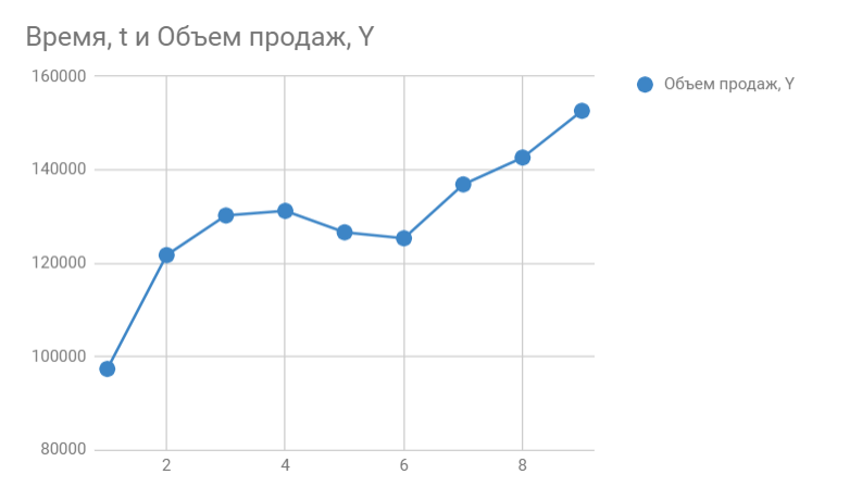
So, we know the sales volume for the past 9 months. This is what our sign looks like:
The next thing we need to do is determine the coefficients a0 And a1 to forecast sales volume for the 10th month.
Determining Model Coefficients
We are building a schedule. Horizontally we see the deferred months, vertically the sales volume:
In Google Sheets we select Chart editor -> Additional and put a tick next to Trend lines. In the settings we select Label — Equation And Show R^2.
If you do everything in MS Excel, then right-click on the chart and select “Add trend line” from the drop-down menu.
By default, a linear function is built. On the right, select “Show equation on diagram” and “Value of approximation reliability R^2”.
Here's what happened:

On the graph we see the equation of the function:
y = 4856*x + 105104
It describes the sales volume depending on the month number for which we want to forecast these sales. Nearby we see the coefficient of determination R^2, which indicates the quality of the model and how well it describes our sales (Y). The closer to 1, the better.
I have R^2 = 0.75. This is an average indicator, it indicates that the model does not take into account any other significant factors besides time t, for example, it may be seasonality.
We predict
y = 4856*10 + 105104
We get 153664 sales next month. If we add a new point to the graph, we immediately see that R^2 has improved.

In this way, you can forecast data several months in advance, but without taking other factors into account, your forecast will lie on the trend line and will not be as informative as you would like. In addition, a long-term forecast made in this way will be very approximate.
You can increase the accuracy of the model by adding seasonality to the trend function, which we will do in the next article.
Charts and graphs are used to analyze numerical data, for example to evaluate the relationship between two types of values. For this purpose, a trend line and its equation, forecast values calculated for several periods forward or backward, can be added to the data in a chart or graph.
Trend line represents a straight or curved line that approximates (brings closer) the original data based on a regression equation or moving average. The approximation is determined using the least squares method. Depending on the nature of the behavior of the source data (decreasing, increasing, etc.), an interpolation method is selected that should be used to build a trend.
There are several options for forming a trend line.
Linear function: y=mx+b
where m is the tangent of the angle of inclination of the straight line, b is the displacement.
A straight trend line (linear trend) is best suited for quantities that change at a constant rate. Used in cases where data points are located close to a straight line.
Logarithmic function: y=c*lnx+b
where c and b are constants.
A logarithmic trend line corresponds to a data series whose values initially increase or decrease rapidly and then gradually stabilize. Can be used for positive and negative data.
Polynomial function (up to the 6th degree inclusive): y= b + c 1 *x + c 2 *x 2 + c 3 *x 3 + ...+ c 6* x 6
where b, c 1, c 2, ... c 6 are constants.
A polynomial trend line is used to describe alternately increasing and decreasing data. The degree of the polynomial is selected so that it is one greater than the number of extrema (maxima and minima) of the curve.
Power function: y = cxb
where c and b are constants.
A power-law trend line gives good results for positive data with constant acceleration. For series with zero or negative values, the construction of the specified trend line is impossible.
Exponential function: y = cebx
where c and b are constants, e is the base of the natural logarithm.
Exponential trend is used when the change in data is continuously increasing. Constructing the indicated trend is impossible if the set of values of the series members contains zero or negative data.
Using linear filtering according to the formula: F t = (A t +A (t-1) +⋯+A (t-n+1))/n
where n is the total number of members of the series, t is the given number of points (2 ≤ t< n).
A trend with linear filtering allows you to smooth out data fluctuations, clearly demonstrating the nature of the dependencies. To build the specified trend line, the user must specify a number - a filter parameter. If the number is 2, then the first point of the trend line is defined as the average of the first two data items, the second point is defined as the average of the second and third data items, etc.
For some types of charts, a trend line cannot be constructed in principle - stacked charts, volumetric charts, radar charts, pie charts, surface charts, and donut charts. If possible, you can add several lines with different parameters to the diagram. The correspondence of the trend line to the actual values of the data series is established using the approximation reliability coefficient:
The trend line and its parameters are added to the chart data using the following commands:

If necessary, you can change the line parameters by clicking on a row of chart data or a trend line to open the Trend Line Format window. You can add (or delete) a regression equation, an approximation reliability coefficient, determine the direction and forecast of changes in a data series, and also correct the design elements of the trend line. The selected trend line can also be deleted.
The figure shows a table of data on changes in the value of a security. Based on these conditional data, a scatter plot was constructed, a third-order polynomial trend line (specified by a dashed line) and some other parameters were added. The obtained value of the approximation reliability coefficient R2 in the diagram is close to unity, which indicates the closeness of the calculated trend line to the problem data. The forecast value of changes in the value of a security is directed towards growth.
Graphing
Regression analysis
Regression equation Y from X called functional dependence y=f(x), and its graph is a regression line.
Excel allows you to create charts and graphs of fairly acceptable quality. Excel has a special tool - the Chart Wizard, under whose guidance the user goes through all four stages of the process of constructing a chart or graph.
As a rule, plotting begins by selecting a range containing the data on which it should be plotted. This start simplifies the further progress of plotting. However, the range with the original data can be divided at the second stage of the dialogue with DIAGRAM MASTER. In Excel 2003 DIAGRAM MASTER located in the menu as a button or a diagram can be created by clicking on the tab INSERT and in the list that opens find the item DIAGRAM. In Excel 2007 we also find the tab INSERT(Fig. 31).

Rice. 31. DIAGRAM MASTER in Excel 2007
The easiest way to select a range of source data in which this data is located in adjacent rows (columns or rows) is to click on the upper left cell of the range and then drag the mouse pointer to the lower right cell of the range. When selecting data located in non-adjacent rows, drag the mouse pointer along the selected rows while pressing the Ctrl key. If one of the data series has a cell with a name, the remaining selected series must also have a corresponding cell, even if it is empty.
To carry out regression analysis, it is best to use a Scatter diagram (Fig. 30). When building it, Excel perceives the first row of the selected range of source data as a set of argument values of the functions whose graphs need to be plotted (the same set for all functions). The following rows are perceived as sets of values of the functions themselves (each row contains the values of one of the functions corresponding to the specified argument values located in the first row of the selected range).
In Excel 2007, the axis names are placed in the menu tab LAYOUT(Fig. 32).
Rice. 32. Setting the names of graph axes in Excel 2007
To obtain a mathematical model, it is necessary to draw a trend line on the graph. In Excel 2003 and 2007, you need to right-click on the graph points. Then in Excel 2003 a tab will appear with a list of items from which we select ADD TREND LINE(Fig. 33).

Rice. 33. ADD TREND LINE
After clicking on the item ADD TREND LINE a window will appear TREND LINE(Fig. 34). In the TYPE tab, you can select the following line types: linear, logarithmic, exponential, power, polynomial, linear filtering.

Rice. 34. Window TREND LINE in Excel 2003
In the tab PARAMETERS(Fig. 35) check the box next to the items SHOW EQUATION ON DIAGRAM, then a mathematical model of this relationship will appear on the graph. We also put a checkbox next to the item SHOW ON THE DIAGRAM THE VALUE OF RELIABILITY OF THE APPROXIMATION (R^2). The closer the approximation confidence value is to 1, the closer the selected curve approaches the points on the graph. Next, click on the button OK. A trend line, the corresponding equation and the approximation reliability value will appear on the graph.

Rice. 35. Tab PARAMETERS
In Excel 2007, after we right-click on the graph points, a list of menu items appears, from which SELECT ADD TREND LINE(Fig. 36).

Rice. 36. ADD TREND LINE

Rice. 37. Tab TREND LINE PARAMETERS
Check the required boxes and press the button CLOSE.
A trend line, the corresponding equation and the approximation reliability value will appear on the graph.
Most often the trend is represented by a linear relationship of the type being studied
where y is the variable of interest (for example, productivity) or the dependent variable;
x is a number that determines the position (second, third, etc.) of the year in the forecasting period or an independent variable.
When linearly approximating the relationship between two parameters, the least squares method is most often used to find the empirical coefficients of a linear function. The essence of the method is that the linear “best fit” function passes through the graph points corresponding to the minimum of the sum of squared deviations of the measured parameter. This condition looks like:

where n is the volume of the population under study (the number of observation units).

Rice. 5.3. Building a trend using the least squares method
The values of the constants b and a or the coefficient of the variable X and the free term of the equation are determined by the formula:

In table 5.1 shows an example of calculating a linear trend from data.
Table 5.1. Linear trend calculation

Methods for smoothing oscillations.
If there are strong discrepancies between neighboring values, the trend obtained by the regression method is difficult to analyze. When forecasting, when a series contains data with a large spread of fluctuations in neighboring values, you should smooth them out according to certain rules, and then look for the meaning in the forecast. To the method of smoothing oscillations
include: moving average method (n-point average is calculated), exponential smoothing method. Let's look at them.
Moving Average Method (MAM).
MSS allows you to smooth out a series of values in order to highlight a trend. This method takes the average (usually the arithmetic mean) of a fixed number of values. For example, a three-point moving average. The first three values, compiled from data for January, February and March (10 + 12 + 13), are taken and the average is determined to be 35: 3 = 11.67.
The resulting value of 11.67 is placed in the center of the range, i.e. according to the February line. Then we “slide by one month” and take the second three numbers, starting from February to April (12 + 13 + 16), and calculate the average equal to 41: 3 = 13.67, and in this way we process the data for the entire series. The resulting averages represent a new series of data for constructing a trend and its approximation. The more points are taken to calculate the moving average, the stronger the smoothing of fluctuations occurs. An example from MBA of trend construction is given in table. 5.2 and in Fig. 5.4.
Table 5.2 Trend calculation using the three-point moving average method

The nature of fluctuations in the original data and data obtained by the moving average method is illustrated in Fig. 5.4. From a comparison of the graphs of the series of initial values (series 3) and three-point moving averages (series 4), it is clear that the fluctuations can be smoothed out. The greater the number of points involved in the moving average calculation range, the more clearly the trend will emerge (row 1). But the procedure of enlarging the range leads to a reduction in the number of final values and this reduces the accuracy of the forecast.
Forecasts should be made based on estimates of the regression line based on the values of the initial data or moving averages.

Rice. 5.4. The nature of changes in sales volume by month of the year:
initial data (row 3); moving averages (row 4); exponential smoothing (row 2); trend constructed by regression method (row 1)
Exponential smoothing method.
An alternative approach to reducing the spread of series values is to use the exponential smoothing method. The method is called “exponential smoothing” due to the fact that each value of periods going into the past is reduced by a factor (1 – α).
Each smoothed value is calculated using a formula of the form:
St =aYt +(1−α)St−1,
where St is the current smoothed value;
Yt – current value of the time series; St – 1 – previous smoothed value; α is a smoothing constant, 0 ≤ α ≤ 1.
The smaller the value of the constant α, the less sensitive it is to trend changes in a given time series.