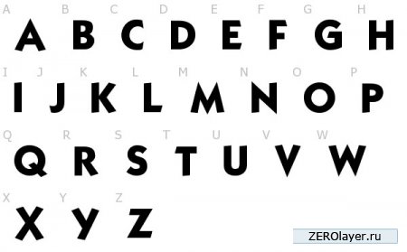
Nice thick letters. Bold type
We use only free fonts and a little inspiration
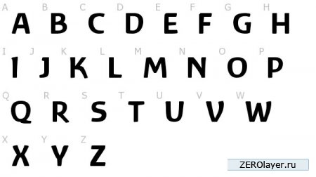
Bold fonts
Bold fonts have always been popular in the printing and advertising business, but they have been unfairly neglected in web design. However, bold fonts can give a design a noticeable impact and enhance its expressiveness. Bold fonts are usually used to enhance effect, and it is important to know how to apply this force correctly. We're not just talking about a huge welcome text that should stand out from the main content. Large font may indeed attract the attention of visitors to your page, but this does not mean that using bold font automatically gives the design a professional look. It's not even about the font, it's about how you present it!
Bold text styling
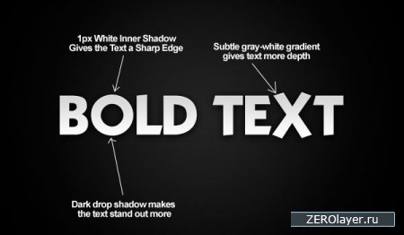
The example below shows how a little font tweaking can make your text stand out. This change is very easy to implement, but it is the work with details that gives incredible expressiveness to the overall effect of perception.
5 Best Free Bold Fonts
Find for real beautiful font sometimes it can be quite difficult, since many of the proposed free fonts They look unprofessional and vulgar. I surfed the internet and found my top 5 favorite free bold fonts available for you to download. They all look very professional and will hopefully give an extra boost to your design endeavors.
AkaChen

(downloads: 820)
Diogene Bold

(downloads: 1072)
Baar Zeitgeist
(downloads: 447)
Whoopass

(downloads: 1465)
Kabel
(downloads: 960)
Bold type in web design
In most well-designed websites, bold fonts serve the purpose of drawing the eye to menu items, navigation, and services. At the same time, an incorrectly chosen bold font can, by its inappropriateness, on the contrary, distract attention. The ten website screenshots below are great examples of how to properly incorporate bold fonts into your design.

Mike Precious uses large font combined with subtle gradient and highlighting to immediately capture the user's eye. IN in this case What primarily attracts attention is his work, as its design has visual superiority over the page header menu.

This site uses a very prominent, large headline that immediately strikes the user. Further, the user's gaze, driven by the repeated “RE” in the text, moves lower, involuntarily associating a similar font at the top and bottom of the page.

The VideoHive website uses a nice “chunky” font to first tell the user what this site is all about, then, as they navigate through the content, intrigue them and encourage them to subscribe. Using an image of the text rather than the text itself, you can apply a gradient and drop shadows to it, which will make it stand out even more.

Alpha Multimedia Solutions makes a strong immediate impression with its large text logo. The logo leads the user’s gaze further down the page, literally provoking him to study the main content.

Evershed Golf focuses on its website to highlight the latest events and golf schools.

Logo Design Love combines a logo and a headline in a standout bottom of the page. In this way, a certain brand is created and at the same time the user gets the opportunity to get an idea of the general focus and theme of the site.
Your thoughts
I'd be interested to know what each of you thinks about using bold fonts in design. Feel free to post your favorite developments and methods in the comments to this article.
Instructions
If you want to highlight a bold font with color, insert tags at the beginning of it, removing spaces:< b > < s p a n s t y l e = " c o l o r: b l u e " >. “Blue” – blue. You can enter any other color in English if you want. At the end of the selected text, insert tags without spaces:< / s p a n > < / b >
A space is a printed character with which words are text are separated from each other. It is customary to put one space between two words. If you remove it, the text will become unreadable, however, make the text without spaces or reduce the number spaces between words is quite easy. The described principle of action is suitable for most text editors; the differences between them are not too significant.
Instructions
To clearly see the gaps in text(not empty space between words), switch to the mode for displaying paragraph marks and other hidden characters formatting. To do this, on the “Home” tab, click the “¶” icon in the “Paragraph” section. The symbols that appear are not visible when printing a document; they only serve to facilitate orientation in text. The space character looks like a dot in the center of the line.
You can remove all spaces from text in different ways. Place the cursor in front of the new word and press the BacSpase key - this will remove one printed character (space) to the left of the new word. Place the cursor at the end of the word and press Delete key– the printed character located to the right of the cursor will be erased. But editing text one character at a time is often inconvenient. To delete several at once spaces To honor the text, select them with the mouse while holding down the Ctrl key, then press the BackSpase key.
To make all the text without spaces in one operation, use the replacement function. On the “Home” tab, select the “Editing” section, click the “Replace” button. In the dialog box that opens, on the “Replace” tab, enter a space character in the first empty “Find” field (no visible characters will appear, but the cursor will move one character to the right). Leave the second “Replace with” field blank. The “Replace” button searches and replaces one printed character, allowing you to control the replacement process. The “Replace All” button makes it possible to immediately delete all found in text space characters.
If in normal text The spacing between letters looks like spaces, perhaps they have sparse spacing. To return to simple, familiar spacing, select the text (or part of the text) and go to the Home tab. In the Font section, click the arrow button to bring up a dialog box. In the window that opens, go to the “Interval” tab and use the drop-down list to set the values you need.
You will immediately determine whether your font is Russian or English if you launch any text editor and start entering words. To switch from Latin to Cyrillic (from English to Russian), click on the “ Language bar» left mouse button. In the drop-down menu, with the left mouse button, select the line “Russian” - the input language will change. From the keyboard, switching between languages occurs when you press the combination Alt keys and Shift or Ctrl and Shift.
Additional options to enter text and display the "Language panel" you can configure in the "Language and regional standards" Call it by clicking on the "Start" button and selecting the "Language and Regional Options" icon in the "Control Panel" in the "Date, time, language, and regional options" category. Go to the "Language" tab and click the "More details" button in the "Language and text input services" section.
In the additional dialog box that opens, go to the “Options” tab and click the “Language Bar” button located at the bottom of the window. Place a marker in the fields you need to customize the display of the “Language Bar”. By clicking on the "Keyboard Options" button, you can set which keys you will use to switch from English language into Russian font when entering words. Apply the new settings, close the windows.
One of quick ways to create a gold stylized lettering is to apply it to the test layer gradient fill and relief. All of these options can be adjusted in the Layer Style dialog box graphic editor Photoshop.

You will need
- Photoshop program.
Instructions
Open the picture on top of which you need to make the inscription gold font or create new document in RGB mode, select the New option from the File menu. Turn on the Paint Bucket Tool and fill the layer of the created document with any dark color. This color will not affect the inscription in any way, but the gold letters on dark background will look much more impressive than on light or transparent ones.
Make an inscription using the Horizontal Type Tool. The layer style you'll be adjusting looks more natural on serif fonts. You can change the font of an already made inscription by selecting the text and selecting new font from the drop-down list below the main menu.
Fill the letters with a reflected gradient from dark yellow to light yellow. To do this, apply the Gradient Overlay option of the group Layer style Layer menu. Click on the gradient bar to open the gradient settings window. Select the leftmost color marker, click on the colored rectangle that appears in the settings window, and select a dark yellow color from the palette that opens. Use the same method to set the right marker to light yellow.
To make it easier to select colors for a gradient, open in Photoshop image some gold object. To select the darkest color in the gradient, click on the dark area of the item. A light fragment of the image will help you select the light component of the gradient.
In the Style field of the gradient fill settings window, select Reflected. As a result, the inscription should appear dark edges and a light middle. If the top and bottom of the letters are lighter than the middle, check the Reverse checkbox.
To customize the embossing, go to the Bevel and Emboss tab. From the Style list, select Inner Bevel, and from the Technique list, select Chisel Hard. Adjust the Size parameter so that the letters have sharp edges. From the Gloss contour list, select Cone, Ring, or Ring-double depending on which setting will make your text look most realistic. If, after adjusting the gloss, noise appears on the inscription, check the Anti-aliased checkbox.
Gold the font is ready. If desired, add to the letters external glow by going to the Outer Glow tab. The Spread and Size parameters are responsible for the size of the glow, and Opacity, as you might guess, for its transparency. For the glow color, you can leave the default color.
Sources:
- Gold text in Photoshop
Russian fans of the game Counter Strike rightfully occupy an honorable place in the “gaming” world. Therefore the desire to change Name his servers looks completely natural in Russian.

Instructions
Start your server and open the Cstrike folder. Locate the server configuration file named server.cfg and open it. Determine the line with the value hostname and enter the desired server name in it after the word hostname.
Expand the “File” menu in the top service bar of the application window and select the “Save As” command. Specify the encoding as UTF-8 and uncheck the bom field. Confirm the changes made by clicking OK and restart the server.
If you cannot save the desired server name in UTF-8 encoding, create a copy of the entire contents of the server.cfg file. Call the main thing system menu by clicking the “Start” button and go to “All Programs”. Expand the Accessories link and launch the Notepad application.
Create a new text document and paste the saved text from the server.cfg file into it. Expand the “File” menu in the top service bar of the Notepad application and select the “Save As” command. Enter the value server.cfg in the “File Name” field and select the “Text Documents” option in the drop-down menu of the “File Type” line. Select UTF-8 from the Encoding field drop-down menu and confirm your choice by clicking the Save button.
Place the created document in the server.cfg file and save the changes you made. Restart the server to apply them. Please note that any changes made to the server.cfg file after the server name has been changed will result in the above operation having to be repeated.
In cases where the user lacks fonts from standard Windows collections, you can download your favorite collection from disk or from the Internet. So that the system or specific program"saw" new fonts, you need to know how and Where install them.

All fonts on your computer are located in the Fonts folder specially designed for this purpose. Through the “My Computer” element, open the disk with the system and find it in Windows folder. Each font located in the specified directory can be viewed. Left-click on the file of interest - a new dialog box will open with a description of the font (size, version, digital signature and so on) and with visual examples of how they write words. You can also access the folder with fonts in another way. Click the Start button or Windows key, open Control Panel and select the Appearance and Themes category. On the left side of the window you will see a link line “Fonts”. Left-click on it and you will be taken to the desired folder. If the Control Panel has classic look, the folder with fonts is available immediately. After downloading the font from the Internet, copy it to the clipboard using the “Copy” command called from context menu file when you click on it right click mice. Or select the file and press on your keyboard Ctrl combination and C. Open the Fonts folder and use the combination Ctrl keys and V or Shift and Insert to paste the new font into it. You can also use the “Paste” command in the “Edit” menu for this operation. The font will be installed.Exist special programs, designed to work with fonts, for example, Font Navigator. Using such utilities, you can view collections and install them on your computer. After installing the application, launch it and specify the folder in which the new fonts are stored. When the list is generated, select the font or several you are interested in and select the “Install” command from the menu or click the one intended for this hotkey. The utility will automatically copy the new font to the Fonts folder.