Trendy colors in web design. Avoiding "typical" stock photos
Every year the number of sites that surprise and delight with new design features is growing. Two years ago, we posted a translation on web design trends 2015. What has changed since then? Emphasis continues to be placed on high-quality graphics and minimalism, large fonts and interactive elements (for example, hidden menu). However, technologies do not stand still, and web designers are experimenting with dynamics, animation, the position of objects on the screen, while not at the expense of site performance. We bring to your attention an overview of the trends that, by tradition, are set by our Western colleagues.
1. The principle of "mobile-first"
The name of the principle speaks for itself: the design is developed, first of all, taking into account the convenience of viewing on the screens of mobile devices. This principle is not new, but since more than 60% of users access the Internet from smartphones, it became defining this year. Since the screens of mobile devices are small, designers provide for the most informative, but at the same time effective display of content. The same applies to texts - there is no place for water and empty phrases in the concept of "mobile-first".
2. Freehand illustrations
This is a great way to convey an idea or mood in an original way. Hand-drawn illustrations are unique, adding variety and informality to the interaction of the user with the site, making the design warm and friendly.
Sample illustration from dropbox.com
Talented illustrators can create images that the best way will match the brand and corporate identity, with their help you can achieve deep personalization.
3. Animation
Designers are gradually moving away from using only static images and looking for new ways to engage the audience in order to stand out from others. Brands need personalization, and animation, thanks in large part to the advancement of HTML5, CSS and jQuery, plays an important role here.
Animation can be implemented in different ways: from an unusual loading status bar, which will brighten up the waiting, to a change appearance object on hover. There is also full-screen animation, which is the central element that focuses the user's attention.
But animation should be used sparingly to deepen the user's interaction with the site, not scare them away. After all, no one wants to wait for the main content to be viewed while the ridiculous and useless animation is loaded - everything should look natural, appropriate and not distracting.
4. Bold colors
Until recently, experts recommended using only "web-compatible" colors in design - those that do not cause irritation and do not strain vision. Today, everything is changing - when used correctly, bold colors work wonders, turning ordinary sites into vibrant, juicy and memorable.

An example of using bold colors on spotify.com
Vibrant colors are a way of personalizing in the global fashion for minimalism in design. It is likely that designers will continue to experiment with palettes, creating unique gradients and bursts of color.
5. Unusual scrolling and parallax
In the past, designers have tried the most important information place in the part of the page that the user sees immediately after going to the site. Today, it is difficult to determine which part of the page will be "visible", because the transitions are carried out from devices with different resolution display. Therefore, a different approach is needed.
Scrolling, originally required to move up and down the page, is now being used creatively by designers. With skillful implementation, it becomes universal tool content submission. So, you can automatically configure the display and stop of video or animation when scrolling, the appearance of text and images, etc.
6. Asymmetric patterns
2016 was influenced by mesh patterns, and in 2017 there was a trend towards asymmetric and “torn” patterns. Despite the overwhelming majority of brands preferring traditional and straightforward card UI templates (after all, they are logical and easy to navigate), some still start experimenting in order to stand out and detach from the competition.

Asymmetric design example (isaidicanshout.com)
Asymmetrical design created by skillful hands, great for drawing attention to certain parts of the page. Thanks to different sizes fonts and the arrangement of elements can correctly place accents on the page and guide users in the right direction.
7. Shadows
Shadows themselves are far from new to web design. At one time they were popular, then they were forgotten. What is the trend then? In the use of huge, sometimes even hypertrophied shadows cast by images on hover.

Deep shadows on hover over images (abduzeedo.com)
This approach allows you to focus on the active element in a flat template and engage in interaction. This creates the effect of depth - it is pleasant to just move the cursor over such images.
8. Large and bold fonts
Typography is another way to personalize. Distribution of devices with high resolution screens makes fonts readable and legible, so designers are increasingly experimenting with them.

Usage example large print(bigyouth.fr)
9. Ultraminimalism
Minimalism has long been a defining trend in web design. But some go further, removing any hints of decor from sites, leaving only the most important elements for users.

Absolute minimalism (mathieuboulet.com)
In this example, there is only an indication of "Scroll", a link to the section "About Me" and links to profiles in social networks. Further, when scrolling, there is already a designer's portfolio.
10. Mix of horizontal and vertical text
Change of habit horizontal arrangement the text "refreshes" the site and motivates to read what is written there.

An example of unusual text direction (takewhatyoucancarry.com)
Please note that the mix is well done - there are no unnecessary confusing elements here. The word "take" is written vertically - this is enough for branded content presentation.
11. "Modulation"

In this case, the text should contrast with background images so they don't merge.
13. Two-color
The site design is based on 2 basic colors. It looks stylish and modern. For example, the Australian Design Radio website is designed in this style:

14. "Geometric" fonts
In this case, fonts are combined with a variety of geometric shapes... Fonts like Futura, ITC Avant Garde and Proxima Nova are suitable for this purpose.

An example of using "geometric" fonts (hugeinc.com)
Expressiveness, assertiveness and even some aggressiveness of the site can be given by using very bold fonts of the families mentioned above.
Summing up
In 2017, designers will try to add personality touches to the usual minimalism. Someone will do it using color, someone using fonts, and someone using an unusual arrangement of blocks.
When developing and approving a design, do not forget the main rule - it must be user-friendly and motivate to take the target action. Are you confident in the performance of your resource? The report of the audit of the site in the service can tell you about this “ Personal manager”SeoPult. In addition to the design and usability audit, you will receive a detailed analysis of the technical component, semantics, positions in relation to competitors, etc. All this will help you improve the site and increase its effectiveness as a sales tool.
”John Moore Williams, Head of Content Strategy, Webflow.
The end of the current year is just around the corner, and every web designer has wondered at least once important issue: what will determine web design in the coming 2017? I decided to find an answer to this question and asked the Webflow designers what trends they thought would prevail for the next 365 days. I also gave my own comments to their thoughts.
First of all, let's get the opinion of the chief designer of Webflow, Sergie Magdalin (Sergie Magdalin).
1. Content-oriented design
“The arrangement of design elements within a given structure should be such that the reader can easily grasp the main idea without slowing down their usual reading speed” -Herman Zapf
The past few years have seen a dramatic shift in thinking about the role of design in business. Earlier design was viewed as the final step in the process of creating an object: the designer-wizard comes in the final and showered our product with magic dust to make it better than the competition.
It was very interesting to watch the metamorphoses occurring with the development priorities.
And the most beautiful thing about these metamorphoses was the transition to the model, when the content is again at the head of the table. Designers around the world have realized that users visit sites primarily for content, be it short tweets, voluminous specialized articles, or fresh internet memes. The ultimate role of design is to show content in the most attractive, understandable way and get the best possible result from it.
This is one of the reasons for the transition from a "skeuomorphic" design (when elements are depicted as similar as possible to their counterparts in real world) to a flat, minimal design. For these reasons, Google created Material Design.
Of course, as Newton's third law says, for every action there is a reaction of the same strength. Many designers believe that the flat design trend has killed the very spirit of design. We expect this debate to continue into the coming year, but the focus will remain on content - the core of any design work.
2. High-quality interaction of designers with developers and designers among themselves
The importance of design in shaping a business is increasing, so more and more attention is paid to the collaboration of designers with their fellow designers and their fellow developers.
This concern for interacting with designers stems in part from the massiveness of the mobile and web applications that are being developed today. In addition to the fact that such giant corporations as Google, Facebook, Twitter and LinkedIn require titanic work of a design team with a completely different sides, designers need to always be on the same wavelength with each other. This means that closer communication is required on the project and the ways of the most effective working together.
To facilitate this task, many tools have been created, from collective templates and boards in Webflow's Team to graphic editor Figma interfaces showing changes in real time. I am sure that in 2017 these platforms will be improved and supplemented.
When it comes to the interaction of designers and developers, a lot of attention is paid to extremely important process transfer of work. For example, instead of sending heavy and bulky static images, designers can now share live rendered layouts thanks to tools such as InVision, Marvel, UXPin.
Carson Miller commented on this in his recent TechCrunch article “The Future of Frontend Design”:
“Sooner or later, design tools and design patterns will completely replace front-end development. You can easily create a quality framework for any of your frameworks without having to write code by hand. ”
3. Simplified designer-to-developer process
The design and prototyping tools mentioned above allow you to visualize the different stages of collaboration through visualizations - from animated Keynote files to fully functional websites. This way of sharing work material shortens the response time within the project, thereby improving the quality of the design, increasing the speed of the development team and reducing the possibility of frustration with the result. It also improves customer interactions. For example, for many Webflow users, customer meetings have turned into full-fledged workshops, where designers can quickly implement ideas, and everyone can test their ideas almost immediately.
Web design trends in the coming year according to product designer Gadzhi Kharkharov:
4. Large, loud headline
As the world of web design begins to focus on content, sites are increasingly seeing inspiring headlines with matching fonts - just as big and bold as their content.
The #MadeInWebflow Heco Partners
As you can see in the examples, “large” and “bold” do not only refer to font descriptions. Quicker, it comes that a significant part of the home screen is dedicated to a simple but strong and self-sufficient statement about a product or service. Such a title should contain the very essence and be understandable for any visitor, avoiding excessive bombast (okay, the phrase “Design the impossible” may sound too loud).
Today, when people are constantly busy and overwhelmed with information, such short and powerful statements work well for any brand.
5. Complex markup that comes from the basics of graphic design
If we want to predict the development of web design (by at least, its visual side), you need to refer to the history of the development of graphic design.
In the past few years, web page layout has been limited to CSS, but newer modules such as Flexbox and CSS Grid(which will be released in March 2017), will allow you to implement the most daring ideas in web markup.
Our the main task now - understand how the new features of grid block markup should work within responsive design.
Here are some examples of what to expect (assuming you have a browser that supports CSS Grid, of course, like Firefox Nightly, Safari Technical Preview, or Chrome Canary):
Jen Simmons Experimental Layout Lab
Pay attention to the style of the main block - a clear reference to the history of graphic design.
Grid by Example
You can see more examples on the site.
6.More SVG
SVG (scalable vector graphics - scalable Vector graphics) It has more benefits for web designers and developers than traditional image formats like JPG, PNG, or GIF.
The main advantages of SVG are described in the very name of the format - these are scalability and vector. Unlike raster and pixel-based formats, images in SVG are composed of vectors - mathematical descriptions of the shape of an object. This means that SVG is resolution independent, and images in this format will look great on any screen or device. There is no need to worry about blurry images on the retina.
But that is not all. SVG is also renowned for not requiring HTTP requests to be sent. If you've ever checked your website's loading speed, you might have noticed that these HTTP requests can actually slow down your website. There is no such problem with SVG.
7. Tools for rule-based responsive design
Responsive design has completely changed the way we think about web applications and how to create them.
But, oddly enough, the principle of the programs for creating design has not changed in any way. Most of these tools work like this: you have to create a similar page over and over for different devices and resolutions. In an industry that requires fast generation ideas, rapid development and quick start, such a waste of time is simply unacceptable.
Expected new wave design tools (such as Figma) based on “rules” that adjust the appearance of sites on different screens and devices, thereby reducing the number of repeated actions designer. Such tools rely on the spatial relationships of elements, and when we change the size of the screen or device, they tend to preserve these relationships by resizing the elements and the spacing between them.
By the way, today there are similar tools for website layout not only for designers, but also for ordinary users. For example, TruVisibility.com - the platform adapts the created design exactly according to certain rules, according to which the layout and sizes of elements are adjusted to the screen size. All that remains is to make a few adjustments to make the web page look the way you want it on devices. The user does not need to re-create the version for mobile devices, and this significantly saves him time.
Design Trends in 2017 by Ryan Morrison, Senior Graphic Designer.
8. More vibrant colors
When the era of minimalism and brutalism began in web design in 2016, designers tried to bring more personality to their work, while not going beyond the fashion styles. And there are at least a few cases where bright and bold colors have been used very successfully.
Take a look at the new Asana site with a bold color fill:
New icon Instagram apps drew a lot of criticism, but this redesign undoubtedly refreshed the brand:
Everything Stripe does doesn't require a separate presentation:
As you can see, these are not just bright and bold colors. Gradients are also back in vogue, mixing and blurring colors in hues reminiscent of a midday sky or a blazing sunset. This is a kind of revival of naturalism with bright colors and cheeky gradients, and I personally look forward to seeing more of these in 2017.
Although, maybe you should still slightly reduce the brightness? We are watching you, Asana.
9. More focus on animation
Animated elements have long played a key role in the web interface, and this trend will continue in 2017. In fact, as long as designers have access to the tools to design engaging animations, we'll see these effects become more visible and more sophisticated.
This topic is especially important because creating animations is getting easier every day. At the 2016 Design & Content Conference, animation guru Val Head emphasized that when designing animated elements, designers need to be mindful of the brand's goals and needs in order to achieve the effect that content creators expect to see. If this advice is heeded, the animation will perform tasks that are meaningful to the brand, and not just cause migraines in the user.
10. Unusual markup
2016, like the previous few years, is famous for the endless debate that web design is either dying or losing its spirit.
Those trying to convince everyone of the death of web design are clearly exaggerating. Many people continue to look for ways to present content to users in a new way. One of the most tempting ways is to break the system and ignore the usual grid layout dictated by the rules of responsive design.
The “broken” markup method involves elements going beyond a meticulously aligned grid. Such techniques can sometimes seem even unpleasant to the eye. For example:
Overlapping texts and images:
Texts and images scattered (seemingly) randomly across the page:
This was the first part of the translation of the article “18 Web Design Trends in 2017”. Do you agree with the opinions of Webflow experts? What kind of web design do you think will be in vogue in the coming year?
A good website owner is constantly working to improve it. In this work, he needs to rely not only on his audience analysis, web analytics data and customer reviews, but also on industry trends. Because there are many useful things in trends that can improve the interaction of customers with the site. But trends need to be applied carefully and wisely. Choose only those that are suitable for the solution current problems site and for business development.
Therefore, in this article, we have not only provided a list of web design trends, but also made recommendations for applying these trends to your website.
1. Usability will become a commodity
An example of improving the usability of the site http://www.telemirspb.ru/
Following basic principles Usability helps sites attract more customers and reduce support calls. More and more companies offer site audits, as there is a demand for finding errors on the site. The habit of making purchases, ordering services via the Internet increases the demand for convenient sites.
Alas, many people create websites themselves, and then come to us with the created disgrace. It is important to think over the process of interacting with the resource in advance: which sections will be in the first version, and which will be added later. It is impossible to foresee everything, but pre-planned navigation will save time and money for improvements in the future. Also, choose the engine for the site carefully. You should not choose a blogging engine (for example, WordPress) if you plan to sell something on the site, create product / service pages.
If you work in a highly competitive environment, then you understand how important it is to differentiate yourself from your competitors.
That is why, when planning to create a website or improve an existing one, first of all, you need to look at the interface through the eyes of the client, try to predict the problems that the user may have.
2. Long texts will disappear
Let's be honest with ourselves: no one reads long texts. Exceptions are books and articles. When a client wants to order any service or product, he is interested in specific information: price, main characteristics of the product / service content, delivery terms / deadline. Concise and structured information saves time for the client and disposes of the order. Moreover, if the client compares several sites, then the most concise description will definitely win.
Also, long texts are inconvenient to view from mobile devices, which almost everyone uses. According to the results of world statistics, in October 2016 the number of mobile users there are more than desktop ones.

Look at the audience of your site, for example, in Yandex.Metrica in the Summary → Device type report and see what percentage of customers come from phones and tablets. Don't forget about this audience when posting content.
Add animation to your site wisely. It should be as accurate and fast as possible. Enlarging an image when clicking on it, progress indicators while waiting for results on the site, a pop-up window when adding an item to the cart, changing the color of buttons and links after clicking on it are the most common microinteractions that will definitely help your users.
6. Use of cinemagraphs or "live" images

Widescreen video has been replaced by cinemagraphs - images in which only one element moves. It is best to place them on the first screen of a page to grab the user's attention and create a wow effect.
If you choose such a gif for the theme of the site, it will look very cool. For example, you can take a "live" photo of your main product and post it on Home page or on banners with promotions.
In Russia, cinemagraphs are mainly used in social networks, so we give examples of foreign sites - a site for the protection of water and car rental.
7. Avoiding "typical" stock photos

We hope that all kinds of little people, girls in headphones and photographs of smiling families will disappear from the sites. Example of stock images:

9. Mobile devices first (Mobile First)

The essence of this approach is that when designing a site, you need to think about how it will be displayed on mobile devices... Many articles and books have been written on this topic, for example, we advise you to read Luc Wrobleski's "Mobile First".
As mentioned above (see point 2), mobile traffic is growing and there are even users who do not have a desktop experience. That is why, in order not to lose customers, we recommend optimizing sites for mobile.
The article lists only the most basic trends. Let's see what awaits us this year. If you also noticed some trends and are sure that they will develop, write in the comments, we will be happy to discuss. And if in doubt that your website design is up-to-date or have read the article and found outdated elements - pay attention to the service
A vivid infographic on the development paths of a modern web developer and the technologies he needs to learn to become a front-end, back-end or devops in 2017.
Introduction
The first priority is to define a profile further development... Try, study, try to understand what is closer to you - frontend, backend, devops, or maybe fullstack?
The frontend path
In any area of web development, mastering the basics is at the forefront. For a beginner, obviously task number one is learning HTML, CSS and JavaScript (+ jQuery). As you develop basic skills and expand your theoretical background, you can move on to more specialized things.
There are many JavaScript frameworks and libraries out there that make a web developer's life much easier to own. Among them, you can choose the most convenient and suitable for a specific programmer. package manager, testing and assembly tool, task manager and much more for every taste and range of needs.
Today, the front-end development industry is developing like no other. Frameworks and tools are constantly appearing and improving, new methodologies and patterns are born, the very ideology of the frontend has long gone far beyond the layout. Therefore, one of the primary tasks of a web developer is to stay afloat, to be aware of modern trends development of this area.

Backend path
In the field of backend development, there have also been big changes over the past few years. PHP has long ceased to be a monopoly on the backend technology market, although its latest version PHP 7 is more than noteworthy. Node.js, Ruby and Go have burst into the arena. Modern technologies provide the ability to develop complex business logic and achieve high performance.

The devops way
The work of devops is very demanding. A modern web application is a huge and complex organism, and the task of devops is to keep it functioning correctly. Monitoring processes, working in the cloud, web containers, continuous integration - these are just a small part of the stack of web technologies that allow a web application to exist as a whole and perform its functions.
Let's take a look at what it means to be popular, trendy and modern in web design in 2017. To do this, consider the main trends in web design. Most of them wander from year to year and have already become an integral part of modern site building. This is especially related to development mobile technologies, communication channels and improvement of devices. For example, such a trend as site mobility has become mandatory. The commercialization of the Internet also dictates its tough terms to designers and web developers. At the same time, some of the trends are weakening and becoming less popular, but still remain quite active. Fashionable hobbies characteristic of a short period also appear. For example, last year these were icons with a long shadow of the depicted objects. Geometric patterns have become popular this year, we will also look at them. So let's go in order.
1. Mobile, responsive design
Today, perhaps, the most important and mandatory trend. The site should look equally good on all resolutions of monitors, laptops, screens mobile smartphones and tablets. Search engines, by the way, very closely monitor how well the site is adapted to various devices, and based on this determine the place in the search results. 
2. Active typography
For several years now, one of the most popular trends. Large fonts and typography on a website are two things. First, aesthetic - beautiful lines, the bends and outline of the letters are in themselves an ornament and decorative element... And secondly, this is functionality - with the help of a large font, you can clearly and emphatically convey the main idea to the visitor. 
3. Widescreen video
The full-screen video on the background of the site undoubtedly grabs our attention immediately. it good welcome to keep the visitor interested. The modern development of technology makes it easy to embed videos on the site, which means that designers will increasingly use this technique. However, there is one nuance, it is interesting to watch the video only the first time, the second and third time it is already boring. Therefore, this technique is only effective for new visitors.
5. Cinemography
A good alternative to widescreen video and large background photography. Cinemagraphs are photographs in which minor repetitive movements occur. They are usually presented in gif format and create the illusion of watching the video for the viewer. More about cinemagraphs with big amount examples can be found in the selection 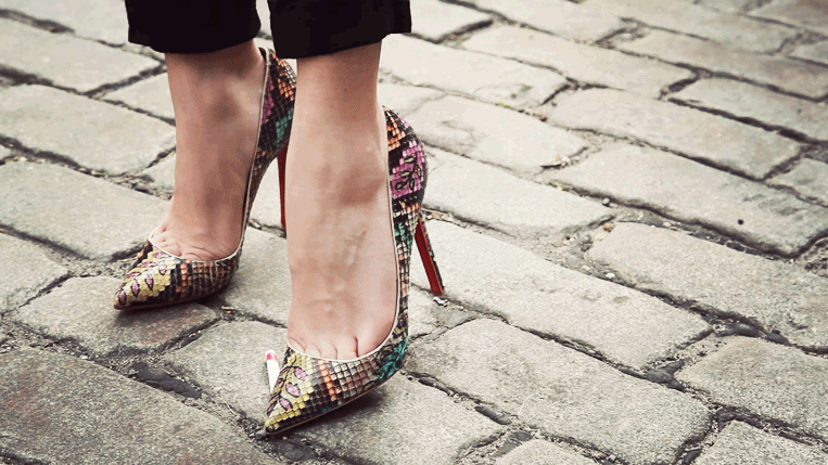
6. Flat design
Another powerful trend in recent years. Flat color websites are neat and clear. But, in recent times, a new kind of flat design has appeared - Semi flat. This is when the entire design is done in flat color, and only one element has a shadow, gradient or texture. Typically, this element is a button, which is given volume or bulge to attract the attention of visitors.
7. Microinteraction on the site
Now great attention in web design, microinteraction of the functionality and design of the site with the visitor is paid. The essence of which is that the visitor can clearly see the result of his action on the site, whether it is an adjustment custom settings, following a link, confirming an operation, interacting with active icons, buttons, switches, counters and other elements.
8. Animating objects
The capabilities of modern html5 and css3 allow you to use a large arsenal visual effects on the site. This makes interaction with the page more interesting and exciting for the visitor. So in the new year we will also see the most unexpected interactive micro-movements of objects, as a rule, reacting to the movement of the mouse. Perhaps we will see examples of more complex animation.
9. Vivid color schemes
Popular trendy colors of 2017 favor brightness and saturation. Interesting original shades of scarlet, mustard, yellow, emerald, deep blue, as well as red, lilac and chocolate colors will help your site stand out and acquire its own unique style. 
10. Scrolling the site
Since site scrolling is ideal for mobile devices, its presence will be significant in 2017. The only thing is that scrolling does not leave room for user interaction, and therefore, one feels a certain fatigue from endlessly loading content. Perhaps the trend will turn towards a combination of simple controls with scrolling.
11. Parallax effect
Parallax is the change in the apparent position of an object relative to a distant background. In web design, this effect is used when scrolling a site, where objects and the background scroll at different speeds, resulting in the illusion of three-dimensionality. The trend is quite stable, so we will see parallax sites more than once.
12. Modular design
The modular design, or card interface, consisting of self-contained blocks of meaning has been popular a while ago. This trend is very good for mobile devices as the blocks line up well for any screen resolution. But on large sites, they look pretty much the same and are difficult to hierarchy and structure.
13. One-pages
One-page sites, landing pages, landing pages have become an integral part of modern internet... You can read more about what a landing page is in the article and. In 2017, landing pages will have an increased emphasis on the button that calls to action - order, call, sign up, etc. Anything else is a distraction potential visitor, will be clipped.
14. Graphic advertising
I would also like to note one thing that I remember about the past year, and most likely the trend will continue in 2017. Due to the commercialization of the Russian Internet and the growth of online commerce, the demand for graphic promotional materials for advertising and promotion has significantly increased - banners, teasers, cards, flyers. 
15. Automation of typical processes
Everything typical solutions and procedures on the site are gradually being replaced automated processes, which eliminates the need to communicate with support or online consultants. In this regard, the popularity of various applications and extensions. Now you can buy a product or service, make an order, make an appointment, book a seat, transfer money, fill out a questionnaire or take a test - all this can be done online in a few clicks of the mouse.
16. Infographics
Graphical presentation in the form of infographics is still popular and in demand. Text accompaniment beautiful picture or an icon combined with stylish design elements make infographics aesthetically pleasing. Comparative infographics are especially visually visual and interesting - like it was-now, yes-no, pluses-minuses, it is possible-not, etc. You can also use infographics to tell a step-by-step story or present boring statistics vividly. 
17. Hamburger menu
Hamburger Menu is a visual icon of three horizontal stripes, as a rule, at the top in the corner of the site, when you click on which it opens or leaves the side full menu... Many experts predict the fading of this trend, for the reason that most inexperienced users simply do not understand the purpose of this icon. Therefore, web designers are leaning towards simplified navigation. But, nevertheless, we will repeatedly see the hamburger menu on newly created sites.
18. Icons
Icons, as a way of presenting information and a visualization tool, have been and remain one of the most demanded and favorite trends for designers. It is enough to put the appropriate thematic icons near the blocks with the text - and now the whole text acquires logical and visual order and structure. So, in the coming year, we continue to actively use icons.
19. Letterstucking
Letter stacking is text in a square. In fact, this is an example of a difficult creative decision - you need to present a long text in a tiny space. At the same time, it should look beautiful and original. It's also trendy this year. 
20. Blank button
Due to space and space savings on mobile devices, an empty button appeared some time ago - a large inscription with a square stroke around the word. Such a button gives an overview of the background behind the button while retaining its functionality as a full button. Plus, as a design element, such a button looks stylish and neat.
21. Refusal from stock photos
Some experts notice that there has been a refusal of designers from stock photography. Insofar as modern devices allow you to quickly and efficiently make a photo yourself, then you can avoid stock depersonalization and unification and make your own unique photo and create your own unique design.
22. Unusual angles in the photo
The search for interesting angles in photographs has become available to any owner of a smartphone with a camera. In this regard, creativity when creating a photo is off the charts and we can decorate the site. unique picture with an unusual viewing angle or perspective. 
23. Carousel
The carousel slider, which entered the design life a few years ago, is still popular and relevant for website design. The wide slider makes it easy to rotate the main news, as well as present current promotions, collections and other up-to-date information, which the visitor sees immediately upon entering the site.
24. Self-playing audio and video
This trend is a hello from the 2000s. I remember then it was fashionable to play a sound when entering a site. And many of them. I can't say that the audio accompaniment makes me happy, but perhaps moderate use will be unobtrusive. Well, self-playing video is more a tribute to advertising, as for me. Well, plus the desire to keep the attention of the visitor in the feed. Not the nicest trend, but commercially necessary.
25. Geometric patterns
Well, we will finish our review of the short-term fashion trend in the form of various geometric patterns and patterns. They became unexpectedly popular at the end of last year. Well, another way to make your website design stand out and unique. 
Web Design Trends 2017 Infographic
I offer you an infographic that clearly shows all the trends and tendencies of web design. Download picture in large size you can follow this link on DeviantArt. A new window will open the DeviantArt page. There, click on the word Download to the right of the picture and save the picture to your computer.