Charts in Microsoft Excel
Microsoft Excel offers not only the ability to work with numerical data, but also provides tools for building diagrams based on input parameters. At the same time, their visual display can be completely different. Let's see how to draw different types of charts using Microsoft Excel.
The construction of various types of diagrams is practically the same. Only at a certain stage you need to choose the appropriate type of visualization.
Before you start creating any chart, you need to build a table with data on the basis of which it will be built. Then, go to the "Insert" tab, and select the area of \u200b\u200bthis table, which will be expressed in the diagram.

On the ribbon in the "Insert" tab, select one of the six types of basic charts:
- Bar chart;
- Schedule;
- Circular;
- Ruled;
- With areas;
- Spot.
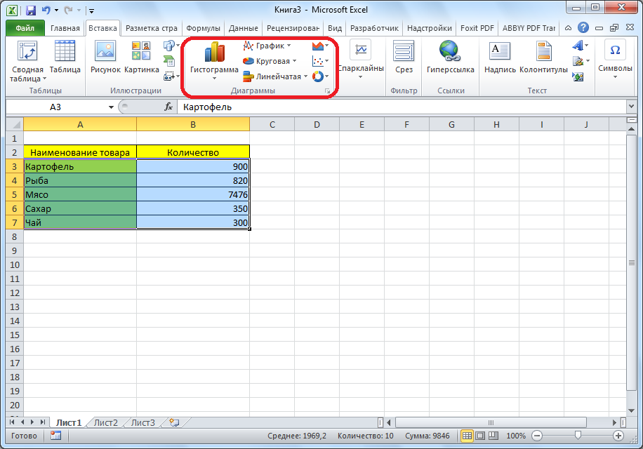
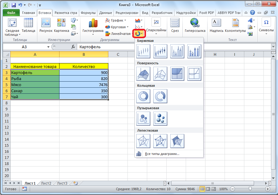
In addition, by clicking on the "Other" button, you can select less common types of charts: stock, surface, donut, bubble, spade.
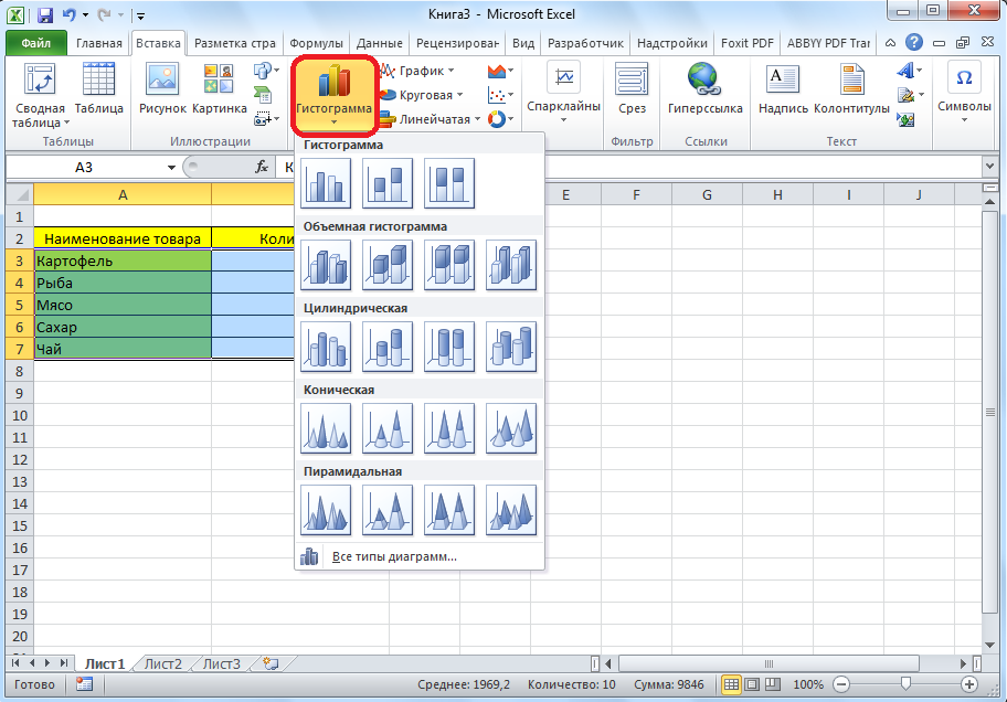
After that, by clicking on any of the diagram types, it is proposed to select a specific subtype. For example, for a histogram, or a column chart, such subviews will be the following elements: regular histogram, volumetric, cylindrical, conical, pyramidal.
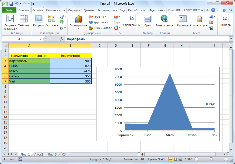
After selecting a specific subspecies, a diagram is automatically generated. For example, a typical histogram would look like the image below.

The diagram in the form of a graph will look like this.

The area chart will look like this.
Working with charts
After the chart has been created, additional tools for editing and changing it become available in the new Chart Tools tab. You can change the chart type, style, and many other options.

The Chart Tools tab has three additional subtabs: Design, Layout, and Format.
In order to name the diagram, go to the "Layout" tab, and select one of the options for naming the name: in the center or above the diagram.

After this is done, the standard inscription "Chart Name" appears. We change it to any inscription that fits the context of this table.
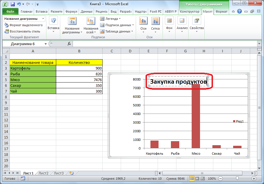
The names of the chart axes are signed according to exactly the same principle, but for this you need to click the "Axis Names" button.

Chart display as a percentage
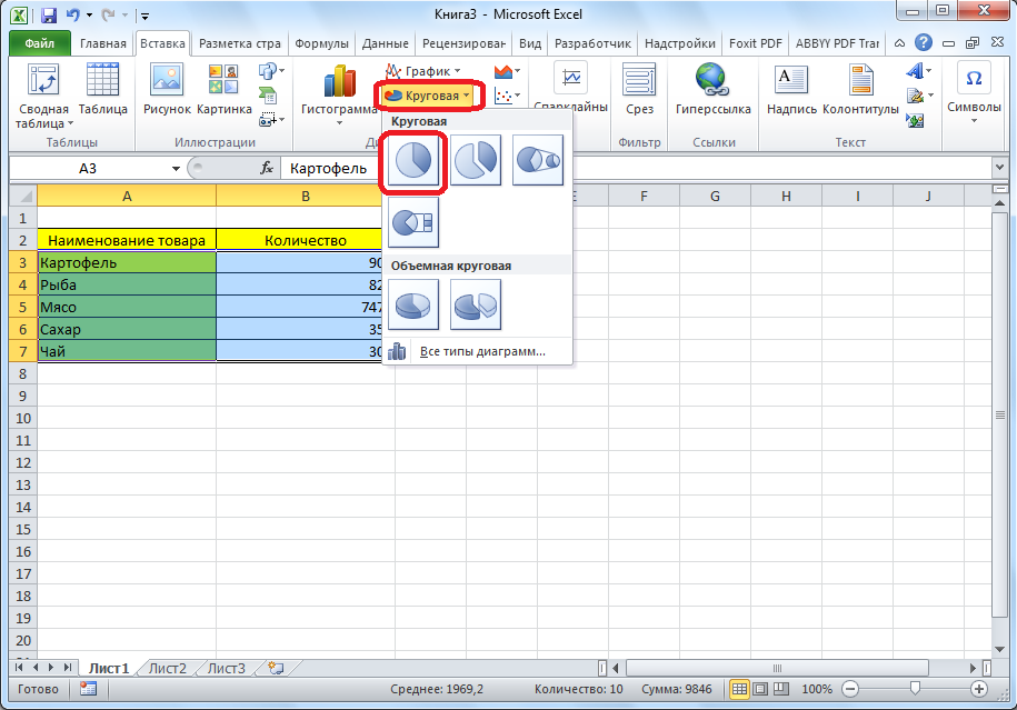
In order to display the percentage of various indicators, it is best to build a pie chart.
In the same way as we did above, we build a table, and then select the desired section of it. Next, go to the "Insert" tab, select the pie chart on the ribbon, and then, in the list that appears, click on any type of pie chart.

The pie chart with percentage data is ready.

Building a Pareto Chart
According to the theory of Vilfredo Pareto, 20% of the most effective actions bring 80% of the total result. Accordingly, the remaining 80% of the total set of actions that are ineffective bring only 20% of the result. The construction of the Pareto chart is just designed to calculate the most effective actions that give the maximum return. We will do this using Microsoft Excel.
It is most convenient to build a Pareto chart in the form of a histogram, which we have already discussed above.
Construction example. The table provides a list of food items. In one column, the purchase price of the entire volume of a particular type of product in the wholesale warehouse is entered, and in the second - the profit from its sale. We have to determine which products give the greatest “return” when sold.
First of all, we build a regular histogram. Go to the "Insert" tab, select the entire range of the table, click the "Histogram" button, and select the desired type of histogram.

As you can see, as a result of these actions, a chart was formed with two types of columns: blue and red.
Now, we need to convert the red bars into a graph. To do this, select these columns with the cursor, and in the "Designer" tab, click on the "Change Chart Type" button.

The Change Chart Type window opens. Go to the "Chart" section and select the type of chart that suits our purposes.

So, the Pareto chart is built. Now, you can edit its elements (chart and axes title, styles, etc.), just as it was described in the example of a bar chart.

As you can see, Microsoft Excel provides a wide range of tools for building and editing various types of charts. In general, working with these tools is maximally simplified by developers so that users with different levels of experience can cope with them.